HELLO!
Hmm.. I like this picture, but I think that it could be better. It's a strong image that received a pretty good score and some nice comments so I'll try to offer some constructive criticism.
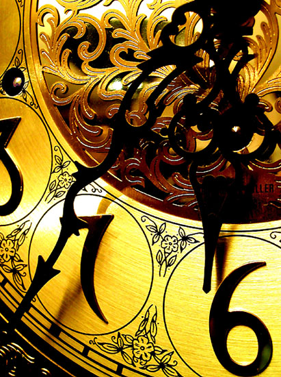
I'm usually complaining that there wasn't enough PS work done and the shot is too grey or bland, but I think it was overdone here. The color is just a little too much "in your face" IMO. I see that lots of people like this, but maybe just a tad less wouldn't be so glaringly obvious.
That hot area by the 7 bothers me. I'm sure that it's a reflective surface and difficult to light evenly, but you could've probably used something to diffuse the light reflecting there.
I think there's a tad too much contrast here. That probably adds to the glare problem, and the dark areas have lost some detail. I'm not sure if it's lighting or contrast, but the hour hand is rather hard to see. It blends in with the bg and shadow too much.
My biggest nitpick would be that the 6 is resting on the bottom of the frame.
It's still a stronger shot than most. You did a nice job.
is this a macro, or a close up of a large clock? just curious. I like it. nice tones, and the features of this clock.. the scrollwork etc.. are just beautiful
Spiffy close up with a title that is rather unclimactic (which I like). This image really shows off the intricacy of the clock while not being too busy. Good composition leads to this, as does your skillful use of contrast.
Loverly colors, would have been better if you had waited for two minutes to have the arms stand out more from the background, plus light up the middle more.





 Add photograph to your favorites
 Add photographer to your favorites

 Photographer found comment helpful.


