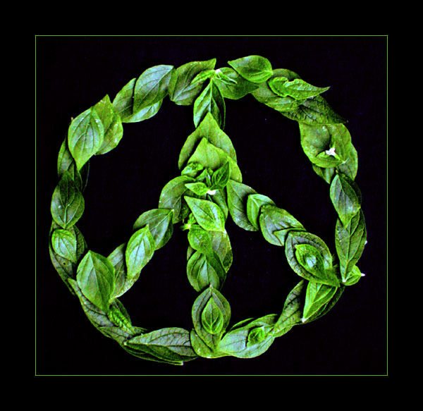
I like the effort that has gone into this photo. The lighting is great, though I feel the border is a bit overbearing. Having the small green border so close to the peace symbol makes it feel a bit constrained, though the large black border on the outside mitigates the effect to some extent.
Otherwise, it's a great shot with a good message and perfect/amusing title. 8
Pretty cool, I like the whole feel of this shot. Good color, pretty good lighting and I like the negative space - I don't think it would have had as much impact with any other kind of background.
Amen to that - great title, great idea!! And we need a little peace this week. The reflections off the leaves are a bit harsh, but the green is a great shade.
This is really inspirational to see right now. Excellent Job! I kind of feel sorry for the plant that has had all of it's leaves ripped off though. :-) Good luck with the challenge!
Composition is nice and simple
Idea is nice and original, well executed
Fits the Challenge
Lighting looks great
Focus seems just fine all round
Colours are fine
I really like your framing with the thin green line then the large black frame.
lovely photography.
funny thing is "green peace" is actually a militant left wing group.. peace doesn't belong in their name :o) but I won;t take off your score for that...
very nice composition and color... the lighting is a little bright and the focus is a bit soft






 Add photograph to your favorites
 Add photographer to your favorites

 Photographer found comment helpful.


