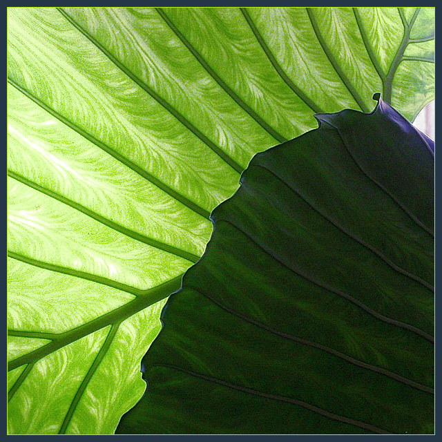
great shot...the lighter green leaf is amazing! i like the darker area as it seems to add an abstract quality to the photo. the only change i would make is to crop out the non-green area on the right.
I found the veining of the translucent leaf very intresting and the darker area overwhelms the delicacy of the lighter leaf. maybe if the contrast were a bit more subtle it would have worked better. I have been cropping out the white light on the right..this is odd but this looks so much better on my laptop screen than on my desktop at work
Composition is good; Photograph meets the Challenge; Visual impact is good; Focus is good; Shows good idea and originality; Colour of photograph is good.
Why didn't you crop out the upper right hand corner where the light shines through?
I think the dark leaf spoils this a bit, the light leaf is absolutely gorgeous and I want to see more of it.
A good shot that would have scored better if it was just the back leaf.
Very cool, the colors and lighting of the leaves is FANTASTIC!! And the darker leaf on the right really makes this picture GREAT! 9. This one may win. :)
Isn't that beautiful! It looks like velvet drapery. I like the little bit of grain, it adds an interesting appeal. I also like that your leaf covers almost all of the frame with one, tiny little exception. I also like the contrast of very light and very dark. This is a really nice image.
Nice shot. I would although have avoided the white area in the upper right corner. It distract a lot from the patter/texture and ver nice contrast between the greens.6. Lionel
Nice abstraction. Appears a little grainy in some areas and it would have been better to omit the "non-green" area on the right. Still, very nice image.





 Add photograph to your favorites
 Add photographer to your favorites


 Photographer found comment helpful.


