This is very cool. I'm astounded at the people who complain that something's been done before. THIS shot, with THIS subject, framed in THIS way, has never been done before. The fact you've continued collecting favorites all along says all you need to know. :)
You know I ponder over this image for close to a year now.
And I didn't copy anything but my own work and that was checking out the other winners work, I read all of his thread. his had flaws and so did this but they won. But look out who's next :-)
can't blame you for the success... its unfortunate that this cliche works OVER and OVER again.. My anger is placed solely on the people who time and again embrace this regurgitation.
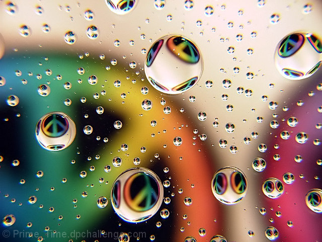
I like. The blurring around the edges detracts _somewhat_ from the overall, but the effect is quite nice, I think, and the vivid, sharp colors all over the place in the droplets are tasty eye candy.
Congratulations on this nice piece of work. For those of us who are old enough to have been around in the 60's, I can say that I saw many peace signs during the day. They were born out of opposition to Vietnam and the sexual revolution -- nothing directly to do with gay rights. The rainbow was later adopted by that group, however peace activists were using it long before then.
I haven't posted here, although I follow the challenges every week. This one inspired me because as another poster noted, it does evoke feelings of nostalgia.... that's art folks. whether the photographer's techniques are beginning to feel like a cliche' or not, the work still evokes emotion. Perhaps this photographer uses this technique with water drops as his signiture style. There isn't a thing wrong with that. Look at Vincent Vercaci's work -- his signiture is the frames that he uses in photoshop. You can tell it is a Versaci when you look at it without seeing his name. Does the technique get old for me? Well yes and no. Sometimes I think that in Versaci's case that the frame is the only thing that makes the picture. . . . But this photo is another matter. What if this photographer would have chosen to use a fisheye lens for several different entries? Helpful photographers might have told him not to over use it, but like with other techniques in photography, sometimes you use a technique until you hit a real winner -- and that's just what this photographer did -- hit a winner.
I think that is one of the nicest pictures I have seen in a while. Since I am a old hippie from those day it rang a bell with me. I had to send it to a friend who last name is Peace I'm sure she will love it also.
yeah and for some reason you can't make it out of the 4's so why don't you leave spurs alone with his blue ribbon. Great shot spurs
Yea, that is precisely the point. God forbid you try anything original here. Sadly, most real art will be original and not readily understood by their peers. The judging here is for people that want to take a cute picture of their cat or something - not for originality.
Honestly, I am glad I am rated low. It shows that most people here don't have a clue. Which reality has taught me that most people in-fact don't much have. So I must be do something right.
Go be a cow, follow the *&^^#$ herd. Go take the 6,342,953,567 picture of Half Dome, what's the damn point? I will continue to innovate and explore new territory. Thats where its at for me. I am currently working at 8:1 with polarized light. How many people are doing that that you know of?
are you serious? have you seen your pictures? and you dare call them innovative "new territory" you took two badly composed of your trash you got nothing worth looking at more than once. art for most ppl invokes some sort of emotion good or bad as long as it has an affect in some way i look at your "work" i feel nothing i think about my bills or something for all i know you could be a good photographer but from what i see your not.
PS hey look i'm being innovative
WOOOOOW! Holy Photons!
Man, how did you ever make your trash look, well, so much like trash?
Im just in awe. REALLY. Trebling as I peck feebly at this keyboard, bowed down humbly in the presence of your art. Absolutely earth shattering. Brilliant. No what - I am riveted. Wow. That is innovative, and good, very GOOD. I can only dream of attaining such levels in my pitiful experience we call life.
Maybe, just maybe because you are a peon. Maybe you haven't a clue. But what is far more likely is that you got IT ALL FIGURED OUT, MAN. And I am blind, so of course I haven't seen my work.
But sarcasm aside, show me something innovative that you have done. I don't mean that picture of your dog, or pictures of martinis (like thats real original; I haven't seen a zillion ads do the same). Show me something unique. Even garbage has been done, try harder. You may not like my work (hey - thats great - I really couldn't care less for your work), but at least I can say it is original. And It works for me. It works for some people - my audience. I am not trying to make "pop". Pop is for corporations, sellouts and losers - NOT - for artists. My limited edition prints sell for over a thousand dollars. So you can call it garbage if you like, but it gets me off and sells, I couldn't be more pleased.
Again, I am relieved that you think my work presented here it is garbage (I assume you have not visited my website), you only reenforce my rant!
yeah and for some reason you can't make it out of the 4's so why don't you leave spurs alone with his blue ribbon. Great shot spurs
Yea, that is precisely the point. God forbid you try anything original here. Sadly, most real art will be original and not readily understood by their peers. The judging here is for people that want to take a cute picture of their cat or something - not for originality.
Honestly, I am glad I am rated low. It shows that most people here don't have a clue. Which reality has taught me that most people in-fact don't much have. So I must be do something right.
Go be a cow, follow the *&^^#$ herd. Go take the 6,342,953,567 picture of Half Dome, what's the damn point? I will continue to innovate and explore new territory. Thats where its at for me. I am currently working at 8:1 with polarized light. How many people are doing that that you know of?
markmyshots sayz: NO one says that about sunsets, waterfalls, birds, and portraits
Um, I do. I say that all of them time. Thanks for reaffirming that I am in fact NO one though. In fact look at my work, I do not have a single picture of a:
I knew this was the one that would win. Some commenters are wrong, peace signs were more 70s than 60s, and really it was the victory sign of WWII. Rainbows were created by God around the beginning of Earth. Even though the idea isn't new, I think the shot is very creative and should have won, as it did. Nice job. Van
markmyshots sayz: NO one says that about sunsets, waterfalls, birds, and portraits
Um, I do. I say that all of them time. Thanks for reaffirming that I am in fact NO one though. In fact look at my work, I do not have a single picture of a:
Congratulations on your ribbon! I make thousands of dollars every year on what some people here would call "cliche" images - it doesn't make them any less good than they are, and this is GOOD. :) Fun shot, very retro.
Congratulations on your Blue, your first ribbon, personal best and Leader of the Pack in this challenge...cool! Great Work, wouldn't have changed anything!
Congratulations on the ribbbon, but i must say that i´m amazed that this picture wound up in 1st place. It has become a bit of a cliché!
I probably would have rated it higher if it had a bit of a twist in it, like the peace sign would be in the middle of at least one drop!
WooHoo - first time I ever picked 1st place!!!!!!!!!!!!!!!!!!!!!!!! Congrats again!!!!
EDIT: I just read the comments you got throughout the challenge and am amazed at some of negativity. I am so glad you got your well-deserved ribbon in spite of any misgivings!!!
I know there are some that think its worn out. It will never wear out. There's always sunsets, flowers, people, and many more things that are the same and someone out there that is going to shoot it. Look at it this way. Your in your studio, you use lights and a subject. Everybody uses subject. I just used a peace sign. Thx JS
I'm sure it won't be the last time something like this will be done and I hope not, becuase there a enjoyable to look at. I'm new to photography and this kind of shot was new to me, so I had to try it. Guess this image was right place, right timing.
Now I had one HECK of week.... the comments from everyone were very AWESOME !!! Thank you so very much everyone! I Have not had much sleep either, have a broken right hand....needed something to cheer me up. Would really like to thank BP for helping me with my first print. I will never be able to beat this score, but I hope.
You here users on this site say I am going to vote down a photograph because I have seen it over and over again. Your photograph is one of the reason I don't agree with that theory. I have tried shot's like this and they are hard and you never know what the outcome will be. So I like the fact you went with a style that has been used a lot but adding one of the most popular symbols of the 70's in your photograph. I think the colors add to the depth of your photograph. So to all that says I'm tired of seeing the same tricks, styles, pictures, etc.... You Earned a 9 from me.
Should have cropped the distortion at the edges and upper part or avoided it by using a spherical glass.
Anyways, it's just great as this photo touches me.
Though you have an awesome picture, I think it lacks originality, for I have seen a photo just like this (the pattern was the american flag) in a previous challenge (transparency). Thats why you dont get a 10 (only a 9 ++). Great photo anyway. Congratulations.
wow, would love to know how you accomplished this. Water drops on glass? Or is it bubbles in some sort of liquid? Would definately hope that this does well, top 3 at least. (10)
That is a fricken cool shot! I know it's a simple (hah!) effect, but the skill with which you have executed it is great. The clarity and sharpness of the drops is awesome. 10.
i would have loved to have this as a huge poster when i was about 19. the colours are beautiful. as well as comopsition, well balanced. keep up the good work.
This is very nicely done, but I am having a negative reaction to the total lack of originality, the waterdrops thing is getting to be a cliche here. Plus, it seems way too "modern" for a 70's challenge. Gave you a 6.
Similar concept worked twice (that I can remember) - once with US and once with UK flag
and
I don't see why it couldn't work this time. Taking someone else's (or perhaps your own - I can't tell now of course) idea and making the best out of it is not so bad. The fact that I have seen something similar to this one and haven't seen something similar to other people's does not mean they did not borrow someone else's concept. I'm trying to say that I am not going to score you down for lack of originality if I like what I see, and I do like what I see.
Even though this has been done several times before, you have pulled it off masterfully! The colors are great, and you executed this one beautifully. A 10 from me. I'll be very surprised if this isn't wearing a ribbon at the end of the challenge.
If I had to be picky it would be to say that to me this is more '60s. However, I am in awe of your ability to create such an image and I can only aspire to one day do the same-9






 Peace
Peace Add photograph to your favorites
 Add photographer to your favorites

 Photographer found comment helpful.