Author Thread
Post actions
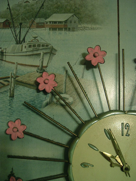
i find it interesting that a lot of people complained about the 1. dust and 2. white balance
Comments Made During the Challenge
Post actions
I like the relationship between the clock and the background. A little dusting on the clock would remove a few of the distractions
Post actions
Post actions
A bit too dark and the whote balance seems off.
Post actions
Nice composition. And clever title.
Post actions
Perfect subject...love the clock with the flowers.
Post actions
I'm going to score this low and figured I'd post why: bad lighting. The composition is alright but the lighting just kills it. I'm giving it a 2.
Post actions
My, but isn't this godawful ugly! Even knowing that this was the photographer's intent it's hard to give this a really high score.
Post actions
Post actions
Looks like it has the dust from the 70's too...LOL
Post actions
love the composition and colors. The glare is a little bright. But a good photo and a great clock!
Post actions
Color balance or white balance seems a bit off? The clock looks more 50's or 60's.







 Add photograph to your favorites
 Add photographer to your favorites


 Photographer found comment helpful.


