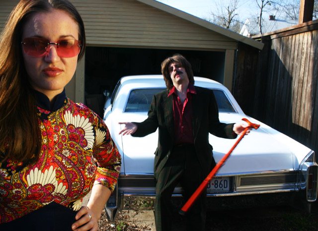
This is an immensely stylish photo - not technically perfect perhaps, but stylish nonetheless. Plus I can't help but laugh my arse off at the guys cheesy mo'.
I still like this one better than any other image in the challenge.
To me quality is about how well it represents something. And I think you have done an awesome job.
Interesting idea, but not the greatest of quality photos. The high contrast on the white car and the man's hands pulls my eyes away from the main subjects. Also, it seems like the light on her face is coming from a different direction then the light in the rest of the photo. But I still love the composition <6>
The lady in the foreground is good but the guy is a bit cheep and should have stopped to strike the pose.
The lighting isn't the same in the FG and the BG, either you could have put a similar light on the guy or used the sunlight for both the girl and the guy.
Fun image though.






 Add photograph to your favorites
 Add photographer to your favorites


 Photographer found comment helpful.


