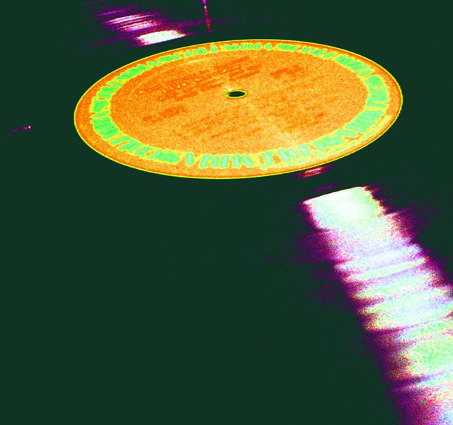
Your style here effectively transports me a bit. What makes really shoots your score up for me is how much of the 70's look you've conveyed through a subtle and common subject. Other people photographed stuff like this, but this one is unique. Oh, and it only really works up close, I think.
I have to assume the oversaturation is purposeful. But not being able to see the rest of the grooves in the record is a problem, especially since this negative space is a wierd and ugly greenish color.
the reflection hitting the bottom right corner of the frame is great composition, but I don't like what was done to the color. The record lable colors bleed together. 4







 Add photograph to your favorites
 Add photographer to your favorites


 Photographer found comment helpful.


