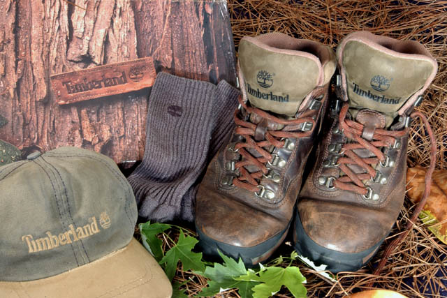
Too many elements / logos, IMO. Looks more like a shop window display than an ad photo. Toss the box and sox for sure. Those boots have loads of character. Maybe getting in close on them with the needles and leaves for a bg would have been more effective. Not bad, but could be better.
Very good picture and nice arrangement. Displaying used shoes instead of new ones gives a good impression of the quality. I think the carton-board tree is disturbing though.
I like the earthy feel you've given this photo. Goes very well with the Timberland products, but it all seems just a little too monotone for me. The socks especially are almost camouflaged
i like this shot. maybe because i'm a sucker for timberland. the tree bark in the background looks a bit faded at first, but it's a nice touch. the bright grean maple (?) leaves adds interest. composition is somehow not striking enough to me.
Wow, simple, effective advertisement! Did you get this out of the catalog? Nice use of props, including the green leaves for added color! (Is the far right shoelace moving? Why?) Photo 10 Advert 10 Creativity 8 total 9
Unnatural set up, one of the shoes should of been kicked over or dirt on the toes, socks stuck in the boot.. Your colors are very nice and I like this idea too. P.S. good light.
At first glance its awesome. After a few seconds I have to start questioning. What's the thing in the back on the left? Is that a card board cutout? I think lighting is such a difficult thing to set up and advertisements must have perfect lighting. You're lighting might have been too direct. You would have benefitted from multiple lightsources indirectly lighting your subject. Look at hte shadow behind the socks, look at the shadow on the shoes by the leaves.






 Add photograph to your favorites
 Add photographer to your favorites


 Photographer found comment helpful.


