Initial Impression:
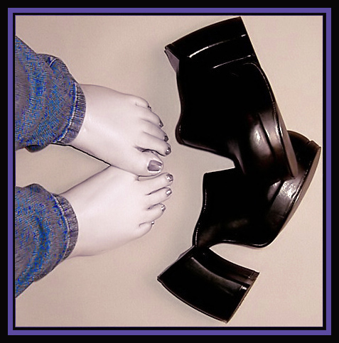
Interesting photo, simple but says a lot. Well layed out, missing *something* though.
Challenge:
Meets the challenge perfectly
Composition:
I really like the composition here, there's nothing superfluous - just a nice clean picture. Maybe the only thing I would have done was to exagerate the tilt your left foot to really give the impression of hurting feet.
Technical:
The camera work here is very good. Everything is well exposed and the reflection off the shoes is controlled. Good job.
Processing:
I'm on the fence about the desaturation.. I like the photo as it is, but could see it working in total B&W too. The problem I found with desaturating everything but one colour is that it creates a rather odd effect between the grays and the saturated colour. It's noticible here, but not that strong because the blue and the gray work pretty well together. Desaturating the blue a bit could have helped as well! The border I'm not found of, unfortunately. I'm very much in the "less is more" camp when it comes to borders. However, that's just my personal preference.
Overall:
Good picture, should have scored higher in the competition!
I like the composition here quite a bit but the color desaturation looks a bit odd... I think this would have done very well as a black and white :) - setzler







 Add photograph to your favorites
 Add photographer to your favorites

 Photographer found comment helpful.


