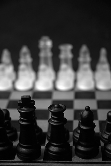
removed some white dust on the black king via cloning (in PS)
grayscale after bumping up red color for added contrast.
then applied a slight unsharpen mask in PS so as to give it some smooth texture across the entire image (ie. blend the harsh lighting better.
shot on a Black backround 2 light sorces 1 indirect the other direct from the left of the black side (the images view)
had a tone of fun with outtakes but this 1 says it best so i hope it does something in the challenge......also i hope i havn't silpped to stock photo i would hate to loose the art in my shots and a chess set seems some how "stocky" i don't know??....
thanx for the comments u all help a bunch and the votes u all help also.....
_brando_
Statistics
Place: 87 out of 182 Avg (all users): 5.3964 Avg (commenters): 5.6667 Avg (participants): 5.2745 Avg (non-participants): 5.5000 Views since voting: 659 Views during voting: 340 Votes: 222 Comments: 3 Favorites: 0
Not bad just looks like the same shot I've seen before. perhaps a broader veiw with the pawn sepated from the rest of the peices would have worked better for me.. As is the DOF is to shallow. I want to see the other peices. It's a little too dark and the chess board shot from the side at a 30- 45 degree angle seems to have been way over done. I don't mean to sound harsh but hwen you here even the best of songs on the radio fifteen times a day everyday.. it gets a bit old.. technicaly not a bad photo. I just can't get interested in it. 5 to remain non bias agaist chess boards.
I am straining to see these pieces, I would have liked more contract and light in this. That may not have been your goal, but just identifying what did not carry well for me.





 Add photograph to your favorites
 Add photographer to your favorites


 Photographer found comment helpful.
