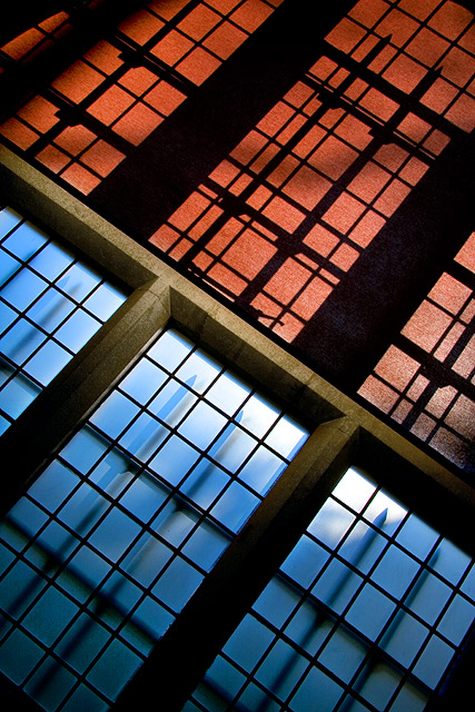
curious if the colors were adjusted dramtically or not. complimentary colors.
though blue should be a bit more prominent, rather than equal in proportion to the orange.
Holey fibberty jibbits. I love this shot. The lines, light and color are spectacular. But I dont see the shades... where is the separation you were trying to show me? This would have been a 9 or 10 in an abstract or achetecture challenge. But alas I see not the separation.. So I will have to frown and give this lovely shot a 7
An architectural abstract that speaks in the purest sense about separation. Technically wonderful, I can't fault it. Even the blown-out highlight seems just right to me.
Wonderful composition! I love how the bottom left and top right corners center their respective window frames. Not a member yet, but I would give this a 9.






 Add photograph to your favorites
 Add photographer to your favorites

 Photographer found comment helpful.


