|
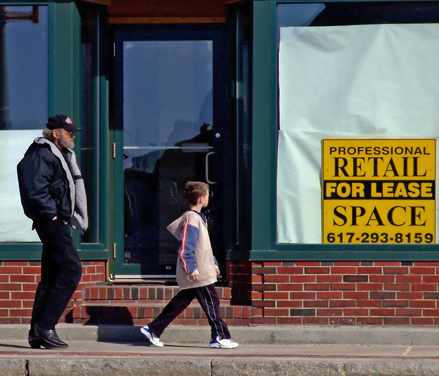
I read the other comments and don't touch the sign. Maybe tone the color down, but the sign gives the image feeling. Kind of a ageing city or uban decay theme. Papered up windows in a vacant brick building. That is why the bright colors don't work for me. I would expect something a little less cheery and a little more gray. |






 Add photograph to your favorites
 Add photographer to your favorites

 Photographer found comment helpful.


