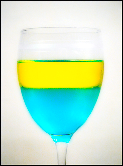
Man, working with glass and liquids sure can be a pain in the... I had to move around a lot to figure out a place to shoot this without getting reflections of windows, chairs, or other objects from around the house. The two liquids are olive oil and gatorade. I know that the wine glass idea is pretty worn out, but I didn't have much else to work with for this subject. If I had noticed the topic sooner, I would've brought home a separatory funnel from lab. Anyway..
My workflow was roughly:
- RAW editing on many aspects
- Levels Adjustment Layer
- Levels Adjustment Layer (diff mask)
- Hue/Saturation Adjustment Layer
- Cloning/Healing
- Feivel's Gothic Glow
- Color Balance Adjustment Layer
- Selective Color Adjustment Layer
I know - that's a lot of work.. you should see how ugly the original is! If I do even moderately okay on this shot, it's all attributed to Photoshop and definitely not any photographic skill.
Lens: Canon EF-S 18-55mm f/3.5-5.6
Statistics
Place: 121 out of 182 Avg (all users): 5.0841 Avg (commenters): 5.6000 Avg (participants): 5.0000 Avg (non-participants): 5.1557 Views since voting: 776 Views during voting: 341 Votes: 226 Comments: 11 Favorites: 0
amen, brutha
I always want to throw something when working with glass
i would've liked to see more of the glass, since the top of it fades out to white. love the colours you chose, they came out great. Also another idea, maybe a darker background with a spotlight effect centered right behind the glass? Does that make any sense? Sometimes I'd get thin poster board and place a track light behind it with coloured paper over the light, looks really cool!
Good color choice, would like to see this on a darker background to really make it stand out. I think an image like this should be crystal clear though.
ooh one of the prettiest shots of this type. I think the colors in this one work very well. I especialy like the green lines. This fits the challenge and has nice colors. I do feel however that the glass could have used a little more definition to help it stand out. As is the quality of the glass V's the quality of the rest fo the shot hurts you a little bit. Overall pretty nice shot, good job.
Two things occur to me as I examine this, first it seems soft in focus when I expect sharp definition with the dramatic colors and second the white background seems to under deliver, leaving it lacking punch. Just my thoughts.
Cool bright colors. The edges of the cup are a little blurred and soft. Also the corners of the frame are a bit dark and clowdy. I've got a crisp monitor and these elements are a little distracting from your subject. Nice shot though.





 Add photograph to your favorites
 Add photographer to your favorites

 Photographer found comment helpful.


