Challenge:1970s (Basic Editing III) Camera:Sony DSC-V1 Location: San Jose, CA Date: Feb 18, 2005 Aperture: 4.0 ISO: 100 Shutter: 1/250 sec. Galleries:Portraiture Date Uploaded: Feb 18, 2005
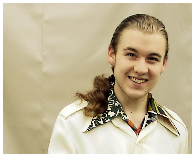
This was taken outside on an overcast day. I tried to edit the colors a bit to make them look more 70's-orange-cast-high-contrast-ish.
Boy, I sure wish this were advanced editing... I would have loved to clone out the crease in the background fabric. I'm sure I'll get dinged for that.
The leisure suit is definitely an American 1970's icon, but it may not resonate with the international crowd. I definitely like the natural expression in this picture, and it shows off the huge collars so popular during the era, but I might have liked to get a full body shot. (I'm kind of limited by budget and space in what I can do, and full shots just didn't work given the setup I had.)
Thanks to my brother Ethan for humoring me in yet another challenge. If I make my average of 5.3, I'll be well enough satisfied for this round.
Statistics
Place: 59 out of 177 Avg (all users): 5.3380 Avg (commenters): 6.0000 Avg (participants): 5.0851 Avg (non-participants): 5.4270 Views since voting: 1616 Views during voting: 548 Votes: 361 Comments: 22 Favorites: 0
there is something really wrong with the quality of the photo. :S It looks like if you took the photo to an already exsisting photo. the background, there is something wrong. but i like the idea.
Oh man, those pointy ones are great. When I had a party a few years ago I stole something like that from my father. I got many comments that it looked cool and wondered where I bought it.
I love this pic... only BUT I can add is.... the obvious line in the background just freaks me out... I want to get an iron and iron it out.... The rest of the pic is in my opinion perfect!!!
good idea and nice setup but I think the DOF could be better to hide the seams in the backdrop and although there were hippies then I think this would look better with just the hair slicked back and not showing the length. Leisure suit wearers usually had that clean cut I'm cool look. Still a good image though.
Would have been better (in my opinion) if you could have blurred the background more. Probably have the model stand further away from the wall. The big seam/fold on the left distracted my attention.
is it just me, or is this shot too grainy? Also seems your efforts for a plain background have backfired, as my eye was drawn to the seam on the left of the shot.
His look is good. I like how the overall tone reminds me of film that has color shifted since the 70's. The background is really distracting though. If you don't have a seamless background I think it would have been better to find a large brick wall or concrete wall to fit in with the whole 70's urban chic.
very 70s look in my opinion good pic. i think the watered down colors adds to the effect. and is it just me or does his face almost resemble draco malfoy from harry potter. the seam in paper is a minor problem
Nice composition. I liked the thumbnail of this but the full version appears to suffer from overprocessing, imo. I am seeing artifacts. Great model and the tones are nice. In basic editing, you can't do anything for the background seam. If you have your subject stand farther away from the backdrop, it will naturally blur the background.
Hard under basic editing, but was it possible at all to get away from having this attention-grabbing crease in the background? Good photo otherwise. 6.





 Add photograph to your favorites
 Add photographer to your favorites

 Photographer found comment helpful.


