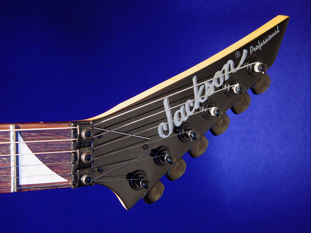
This is the 93rd out of 94 attempts for this challenge... I struggled with this shot for several reasons. First of all, my guitar is not perfect. She has been 'rode hard and put up wet' way too many times. She still loves me though :) Getting the lightings anywhere close to decent was a challenge for me with the tools I have at my disposal. I hope someone likes this photograph...
Statistics
Place: 21 out of 79 Avg (all users): 6.0195 Avg (commenters): 6.4800 Avg (participants): 5.9014 Avg (non-participants): 6.0821 Views since voting: 5288 Votes: 205 Comments: 27 Favorites: 0
Well? Does Jackson only make THAT part of the guitar? I find myself wanting to strain to see what the rest of the guitar looks like, if this was your intention - A+ :) good clarity, good lighting!!
A nice shot of an important functional difference in this brand (are those fine-tuning screws above the nut?) but not the overall design.
If I were doing the whole ad (I've done more design than photography), I'd probably use the two nice spaces you left to composite-in tiny images of the whole guitar (front/back/side) -- this is a very good base image.
Nice crisp shot. Bordering on being over sharpened? There appears to be a blue cast introduced on the subject from either the lighting, post processing, or a reflection? Good effort though.
I really like this one. The shapes are great, well framed, and the colour of the backdrop is daringly vivid :) I'm not sure how it sells the guitar, but it's a cool photograph.
Very nice. One suggestion - If the light were brighter on the part of the instrument with your client's name, and a bit darker in the scratched fret, you might sell more guitars with the ad. Still very good.







 Add photograph to your favorites
 Add photographer to your favorites


