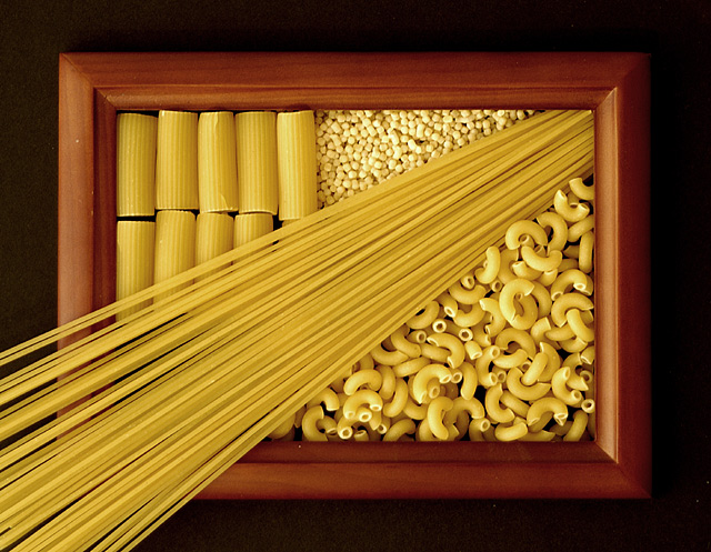
Well, let's see. Technically, I guess this isn't kitchen art because it wasn't taken in the kitchen. Although it easilly could've been. I would've used some of the tricolor pasta if I'd had any at home. But I didn't. I might reshoot this at some point. The idea is not mine (they rarely seem to be). Someone did this on a scanner and I liked it.
You can see the original at //www.langpage.com/dpchallenge/kitchenart/pages/original.html
Statistics
Place: 8 out of 79 Avg (all users): 6.7717 Avg (commenters): 7.6250 Avg (participants): 6.8070 Avg (non-participants): 6.7143 Views since voting: 2522 Votes: 92 Comments: 19 Favorites: 5 (view)
Composition - Very nice decorative variety of pastas arranged neatly on what appears to be a picture frame. This is meeting the challenge very well. The thin spaghetti does a wonderful job of providing leading lines into the picture frame. The first time I saw this during voting that spaghetti, for whatever reason, really reminded me of the sun's rays showing through the window except the sun itself is not visible. I think this quality was the appeal of this photo for me. The spaghetti acts as a sort of border between the mostaccioli noodles and the macaroni noodles. Well conceived by whomever thunk it up. Well executed by you.
Technical - Very well taken photo. Exposure could've been just a little more to give the 3 darker sides of the frame just a bit more light. This is a very nice crisp clear photo though. The kind a well trained Nikon user should take :) I don't see anything unusual about the way this was taken or the post processing. Very nicely done.
Overall - Well set up and well taken photo. The spaghetti makes this picture in my eyes. It acts as a divider and a path for the viewer to follow from the bottom corner right on up into the midst of the noodles. Despite not being your idea, I think it definitely deserves the score it got for great execution. Nice job. Keep up the good work and good luck in future challenges. - Bob
Very nice composition and idea, but the lighting is very flat. With lighting more low across the paste you could have added atmosphere with nice highlights and shadows.
cute idea. gives your shot kind of a 3d effect. focus and clarity are great. lighting is excelent. very nice lighting on the pasta. no distracting shadows or hot spots. I like the angle and framing/cropping you chose for this. very creative and original. good luck in the challenge.
Very nice. I like this very much. The spaghetti protruding in a diagonal beyond the frame is a great touch. This image is full of texture and interest without being overwhelming. Good work! One of my faves this week.
Nice pattern to the Pasta, Nice color, overall.
Good focus,
Visual impact is okay,
Suggestion: I would have tried some coloured pasta's
Good idea though.





 Add photograph to your favorites
 Add photographer to your favorites


 Photographer found comment helpful.


