jjbeguin -- I am honored to have the opportunity to "study" your picture and offer my evaluation of it. As I feel you have much more knowledge and skill in photography than I do, I am abandoning my normal form of critique (composition, technique, overall effect), as I honestly don't think I could tell you anything that you don't already know! :-) Instead, I am going to offer to you my impressions of your picture. I did not get to vote in the "From Above" challenge, so my introduction to your shot was when it was selected from the queue for me to do this critique.
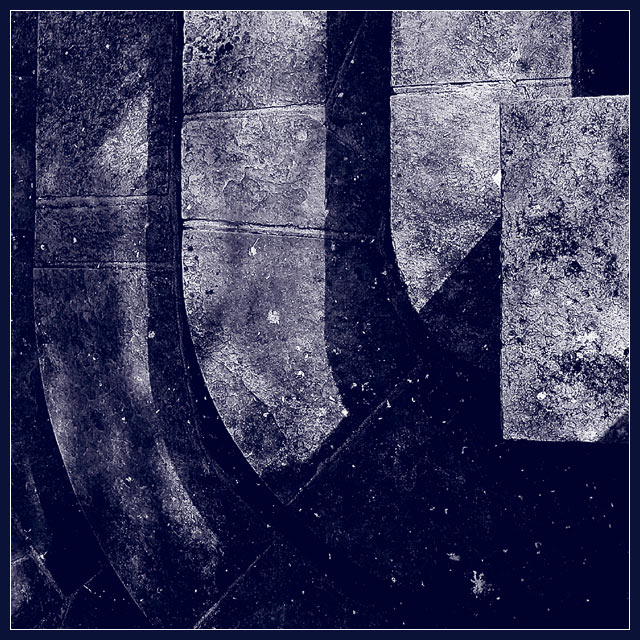
My first impression, honestly, was what am I looking at??? When I saw that it was for the "From Above" challenge, I looked closer and still could not figure it out completely. At this point, while I like the colors and textures, it had a "flat" look to me, and wasn't distinguishable. Then, when I saw that you were the photographer, I knew that there had to be something there, so I looked some more. Upon this third, carefully scrutinizing look, I began to make out the steps. Until then, I had just noticed the strength of downward "thrust" that the lighter areas provided, with a sharp contrast to the upwards diagonal. I was also impressed by the "conflict" of the light vs. dark areas.
This picture to me was kind of like one of those illusions that you study and study, then when you figure out what it is, it is so obvious you want to hit yourself in the head. I suspect in trying to vote on around 200 pictures, people don't have time to study every shot for the 20 or so minutes that I had for this one! As a result, your score is lower than you usually receive. I think those that "got it" voted you high, and those that didn't just didn't get it.
By far the most interesting of this week's entries. You didn't deserve the low score/placing at all in my book. And I simply cannot understand that average from those without cameras! I've since looked at your profile though, and perhaps you don't need me to add anything more.
Very sharp photo! Good texture and details. Contrast - IMO needs to be a bit stronger. Challenge - while I accept this as loooking down, I could see this being possible from a number of angles (except looking up!), no frame of reference. Interest - moderate, nothing eye popping, but nothing horrible either. 6 Swash
Like this a lot: there's almost a mechanical quality to this stonework - and I really can't work out what's going on at all. Excellent in all areas - detail, texture, the b&w really works. Top so far.
An amazing abstract. Probably my favorite image this week. I love how you've taken these subtle tones and contrasted them to synergize into a wonderful study in light, shadow, form and texture. Really well done. I hope it does well. 10 from me!
Ok. this is awesome. Im not quite sure what I'm looking at, but i think it is a heavily edited shot of refelction in water. this is great art to me and I would love to have a large version. My favorite this week. I hope you do well but I fear for the worst (some people on here dont like art very much)
Very nice concept here. I like the darkness, but it seems like you could have created better definition in the photo somehow, it just seems to all run together a little bit too much.





 Add photograph to your favorites
 Add photographer to your favorites

 Photographer found comment helpful.


