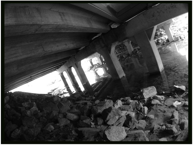
Cool shot! I really like your varied areas of exposure. There are lines that keep your attention moving all over the picture. This shot really takes me back to being a kid, playin in the river underneath the bridge, fishing or catching crawfish... Thanks.
it just amazes me how such a wonderful shot could get such a low score. I suppose it's fairly programmatic: soft focus = bad. blown out areas = bad. I wish people would rise up from their programs and see anew.
Too much? Not enough? This angle didn't do it for me. Look at it from a portrait view - left or right as bottom. Now... either one of them grabbed me on a design level.
Wow... This looks like a part of a walking trail at a local park! Only, it looks like you are on the other side of this bridge! Probably isn't the same place...but it sure looks like it! LOVE the black and white and the tilted angle! 10
Title doesn't fit. This bridge doesn't go into the distance. Rotation is too strong. I like that you can see thru the water, and the reflections are caught well.
this has a great sense of unbalance....I actually tilted my head unconciously to try to right myself. I think it's because the foreground is horizontal.
Would be nice if the outside areas weren't quite so blown out...but that's just preference....i'm not scoring you down on it.




 Add photograph to your favorites
 Add photographer to your favorites


 Photographer found comment helpful.


