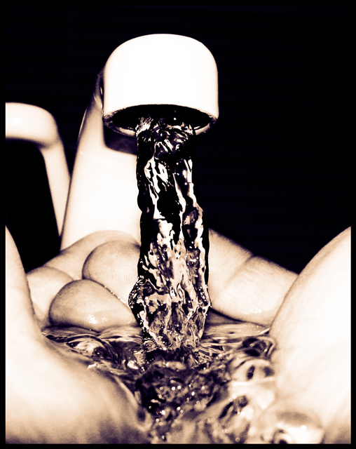
COMPOSITION...I found that this image particularly stood out among the competition in kitchen art. The high contrast and monotone colors are what give the image its appeal I find, and having an undistracting background and purely frozen motion helps a lot :) I think also the angle and closeness the hands were shot at also suggest an intimacy with the subject - it really feels like the photographer and their camera is not present, and we're viewing the scene from the owner of the hands (though not really, the angle's a bit too low, but still, that's what it feels like). Perhaps the only advice I would impart here, is that the way the hands are positioned, with the faucet almost centered, suggests a symmetrical composition, and yet that symmetry is broken because of the angle the picture was shot at... Shooting the faucet straight on may have enforced the symmetry better and added some more strength to the composition.
TECHNIQUE... You lose some focus towards the back and front of the hands, but not enough to hurt the photo. Highlights are blown but it creates a surreal, high-contrast image that is still appealing.
OVERALL... A highly effective image. Would have just tried enforcing the symmetry that is already present. Kudos!
I think this is the winner - I keep coming back to it over and over. I love the angle of this, particularly because I don't know how you accomplished it - self timer? Someone kneeling at chest level?? The fact that I have to keep guessing even improves the image. I've been giving out plenty of 7s and 8s this week, but you are my first 10. I'll be VERY surprised if you don't finish in the top 3.
Very intriguing shot. I guess it's the level on the left, I do not know if could have avoif int one way or another (back piece of paper?)? I think it makes the shot 'unbalanced' even if a perfect simetry is not always good it makes the right part 'empty'. But very intriguing and nice shot. 7






 Add photograph to your favorites
 Add photographer to your favorites


 Photographer found comment helpful.


