Author Thread
Post actions
I can just imagine this printed large, just beautiful stuff.
Comments Made During the Challenge
Post actions
Too dark. Kiied the details
Post actions
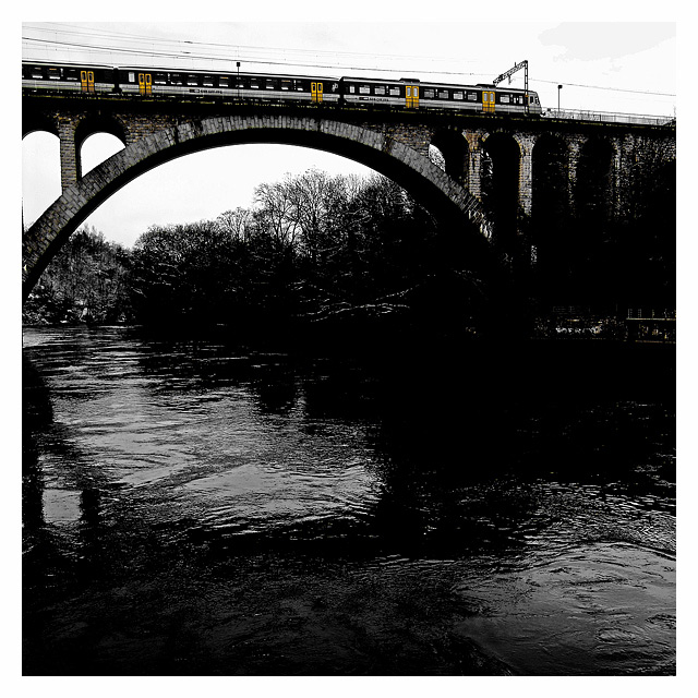
I like the desaturation effect here. The foreground is exceedingly dark, but I feel that it fits with the overall effect of the photo.
Post actions
Great use of specific areas of color. I would like to see just a bit more detail on the right hand side.
Post actions
The yellow doors feel too odd. The track line isn't straight. The middle area is much too dark. But, gosh - the sense of "Circle" arcing above and seemingly under that lush body of water is wonderful.
Post actions
Looks a bit oversharpened, and I feel that its too dark overall, but especially on the right. you can't see any detail there. I like the idea, and the bridge itself
Post actions
Nice bridge but a little dark and the selective saturation is a bit distracting. It makes me look at the train more than the bridge.
Post actions
This is a cool picture, but some of the darker parts are a bit too dark. It would be nice to be able to make some shapes out on the shoreline.
Post actions
how'd you accomplish this in the basic edit?
Post actions
I like this picture a lot. Love the coloring and visually it is very pleasing. I gave it a 10.
Post actions
interesting idea to pull out the yellow
Post actions
Compozition is nice but too much of black water as its not main subject. Also contrast bit overdosed i think.
Post actions
this is really nice, arty, thanks :)
Post actions
good composition but much of the detail of the bridge is lost in the shadows.
Post actions
A little dark, would have liked to see some detail on the far bank. Good comp and I like the selective desat with the doors :)
Post actions
Gorgeous! The desaturation really works for this; the yellow draws the eyes to the top of the bridge and the deeply shadowed black and white really give the scene a delicious sense of foreboding. Brilliantly composed and wonderfully clear. Fantastic work!
Post actions
i think that this would have been a better photo if it was all black and white. the yellow doors are distracting.
Post actions
fantastic! makes the yellow really stand out!!!
Post actions
I dont know how You folks do it, so that it still goes under the Basic Editing Rules, but i want to belive there is a way...
Post actions
I like the motion of the water, not sure of the border though
Post actions
nice contrast here...very nice job
Post actions
Post actions





 Add photograph to your favorites
 Add photographer to your favorites

 Photographer found comment helpful.


