Wow I just saw this in the thread
Awesome work, very similiar to Picasso (and when the Doors played on Ed Sullivan, but no know will understand that one.)
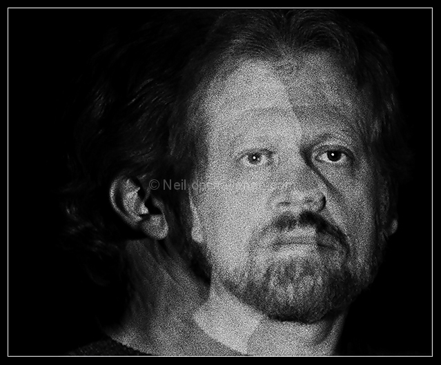
I thought this was brilliant and I wasn't even familiar with Picasso's self portrait (after taking a look at the link I decided I wanted to comment because you did such an awesome job on this shot). I gave you an 8 initially but now I wish I'd given you a 10. Such creativity is not always appreciated by the majority (as the best DPCrs already know) but the majority isn't capable of creating masterpieces.
We are in modern times. It seems many voters are not aware that a portrait challenge is certain to include tradional and modern renditions. Regardless, you are a bit ahead. This is a very good study and very under rated.
Thanks for your comments everyone. I am not sure if the low score reflects people not getting it, or people just not liking it, or in particular the grain. But here's a link to the portrait I challenged myself to imitate:
Returning for comment:
Is this Picasso on Van Gough? A very good effect. It leans a hair over to the graphical side but then it is only a natural extension. This is perhaps one of the most creative efforts in this challenge. Bumping up. Another bump to 8
the way that you've lined this up is really REALLY neat. It took me a second to isolate tthe two photos because of how you've lined up the facial features. I wasn't sure of this when I first saw it, but now that I look at it, I really like it. I hope people don't just glance at this and vote it down without giving it a good hard look. 9
i don't know anything about portraiture, so i'm using your image as a guinnea pig as to what i think i would or wouldn't do in this situation, as well as what i notice and get out of your image.
most interesting effect. great job outstanding job lining up the portrait and the profile. this would be a novel idea to try outside the constraints of challenge editing rules, especially to try with different colors. in many ways, you have captured the essence of the individual. i applaud your inventiveness! 8 from me.
[returning comment: this has a really wild thumbnail view!]
I think that you neil??? I am not sure, but very out of the ordinary for you and all the color that you normally represent. It is a great attempt, I just think that the profile needed to be a bit more clear to work effectively. 7
Hey Neil. This is a really cool illusion. It would be more apparent if you had more light on the left, that way your eye wouldn't be drawn so much to the frontal shot. I didn't see it until I decided to give you a comment. Gotta give you a bump for creativity. I missed it first time round.
I truly love what you did with this one... and I would venture that it will do well in this challenge. I particularly enjoy the different views one gets of the face. This, to me was a very complex photo, which I happen to like very much. I gave this a well deserved 9 ... Good luck.
(Neil, right??) This is SO awesome! I would love to know how you managed lining up the eye so perfectly - it would never have as much impact if you hadn't, obviously. I love the grain too. Really terrific job. Easy 10. :-)
Pretty daring, Neil. You'll get killed on the grain, but the idea is very cool. The strong face-on image makes the profile hard to see, but I do see it. Kudos for thinking outside the cube. 8







 Add photograph to your favorites
 Add photographer to your favorites

 Photographer found comment helpful.


