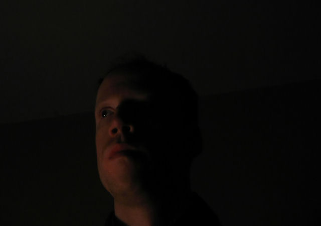
I like the shadows but the picture looks too dark on my monitor.
I can hardly see the details of your face.
Also, I think it is a bit too centered. If you added some more space on the left side and cut some of the right, I think it would have been better.
heh...way too dark. I know it's probably some message you're trying to convey in your work of art...but unfortunately, this is a photography challenge and 'art' doesn't really appeal to a vast enough majority of people. interesting though.
i don't know anything about portraiture, so i'm using your image as a guinnea pig as to what i think i would or wouldn't do in this situation, as well as what i notice and get out of your image.
pose and expression are fine, focus is a bit soft. lighting is ok, but could stand a bit more contrast. line through the head is a bit distracting. placement would be stronger if more to the right.





 Add photograph to your favorites
 Add photographer to your favorites


 Photographer found comment helpful.


