Initial impressions:
Busy. a bit out of focus, doesn't really capture my eye.
Challenge:
Meets the challenge perfectly
Composition:
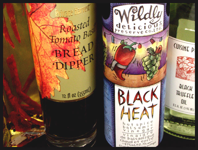
The labels show nice details, but I would have prefered to either see more of all the bottles or just one bottle alone. The top and bottom being cut off the Black heat label is slightly annoying to me as well. The colors, on the other hand, are fantastic. They are well saturated and the contrasts make them zing.
Technical:
It seems slightly blury to me, perhaps too shallow a DOF?
Processing:
Nothing glaring in the post processing of the photo.
Overall:
Nice colors, good visual impact, though I would have liked to see more..
Very appealing colours in this photograph. I think it would have been a more interesting composition if you hadn't cut off two bottles on the sides, and had focused on either or, to have three bottles in focus instead of just two.
Wow I'm jealous, send me some of that Black Heat and a bottle of the truffle oil as well. Nice color although I may have moved the Chili Pepper oil up front. I think it may have matched up well with the Black Heat and would have made a good focal accompaniment.





 Add photograph to your favorites
 Add photographer to your favorites

 Photographer found comment helpful.


