Well Dayum.... I didn't thing it was THAT bad... even though I did upload the wrong pic. LOL Ah well, at least I achieved SOMETHING.
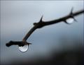
Here's what the pic was SUPPOSED to be:
I had JUST signed up to be a paying member and hurried to take a pic and do some post editing to it. I submitted it at the last second and took the wrong one, since the all looked so similar. Oh well, live and learn.
this picture is out of focus and grainy. you have the right idea on being creative, however, i think it is best to pick one of the other, not both fo pas, to make the image creative.
Returning for comment:
With this image you invite the infamous bell curve. This image reveals nothing about the subject but on the other hand, it is more a graphical reprentation geared towards a novel effect. I will be on the higher end of the bell curve simply because I like these images. Bumping up.
I rather like this - there's a strong quality of glass about it, and the grain/noise is effective. Not wholly convinced about the composition, however. I expect you'll get slaughtered in the voting however.
Returning for comment. Interesting composition - you've filled the frame well. This shot might have been stronger if one element had been kept in focus, particularly the eye. Perhaps some light bounced up from below the chin would have helped with the shadows cast by the bangs. The expression in the eye is good.






 Add photograph to your favorites
 Add photographer to your favorites


 Photographer found comment helpful.


