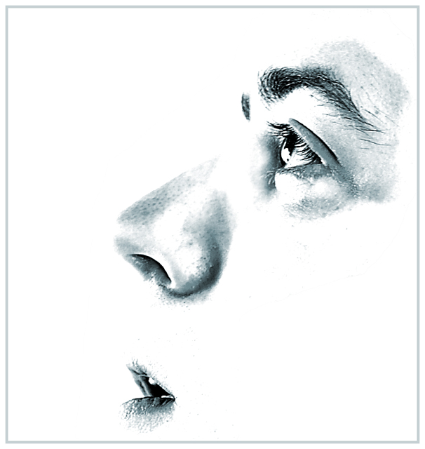
Took a pretty high-key photo to start. Wasn't easy to get the camera pointed at myself, so I used a bigger frame, this crop is only about a quarter of the original.
Using curves, and dodging/burning, I increased the contrast, separated the parts of the face. Using a hue/saturation layer, I colorized it slightly to a blue, dropped the saturation way down. A quick stroke for the border, and that's all.
Statistics
Place: 114 out of 247 Avg (all users): 5.5280 Avg (commenters): 7.2143 Avg (participants): 5.4774 Avg (non-participants): 5.5749 Views since voting: 978 Views during voting: 499 Votes: 322 Comments: 17 Favorites: 1 (view)
I thought this one would be in the top 10!!! I think it's a great photo and a creative take to the challenge. Congratulations and keep up the good work.
Another great artistic study that nears the graphical representation edge. It is like those art studies that hang in exhibitions. The areas allowed visibility are very clear. Bumping up.
Returning for comment. My personal taste does not lean towards high-key, but you've almost convinced me here. Composition is good, expression is good, use of negative space is good. At second look, bumping up.





 Add photograph to your favorites
 Add photographer to your favorites

 Photographer found comment helpful.


