Challenge:Advertisement (Classic Editing) Camera:Sony DSC-P1 Location: New York, NY Date: May 1, 2002 Aperture: F5.6 ISO: 100 Shutter: 1/375 Date Uploaded: May 5, 2002
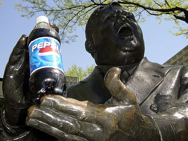
Thanks for all of your comments! Actually, I thought of this pic when I was walking down the street with my esteemed colleague Josh Li (the Kobe of dpchallenge), and I bumped into the statue of Fiorello LaGuardia. It was perfect for an advertisement because of its facial expression and the position of its hand. I was busy with finals, so I just used anything I had in my hand to take the picture, which in this case was a bottle of Pepsi. It looked good so I submitted it.
1. I tried to get the best angle possible at the time, and this one happened to be the best. There were trees and buildings all over, and this angle minimized the "busyness" of the background.
2. I used the maximum fill flash on my camera, which failed to eliminate the shadow on his face. I didn’t have time to come back on a different day or time.
3. I also tried to get an angle to minimize the sun’s glare off the bottle… but I probably could have done better at a different time of day.
4. I am not about to wipe that stuff off his face. Besides, the “drooling” effect was kinda funny!
Really like the idea. I see just a few minor problems: glare on the Pepsi bottle is too strong (maybe if you shot at a slightly different time of day to remove), the buildings in the background (a different angle to either make them a more or less prominent feature of the image), and the tree branch kind of looks like it's balanced on top of his head (again, slightly different angle).
I really like this one. Lighting is a tad uneven for a 10 (label too bright and has streek and the face is too dark) Without adding lighting you did good. The angle is perfect.
Isn't that Bill Hailey? Should of been titled ''Pop around the clock'' Love the composition and framed perfectly. Its a shame the face is not more illuminated, otherwise brilliant.
Pretty funny. Just a bit too much reflection in the label. It may have required shooting at a different time of day or blocking the bright sun a little. The branch is distracting, too.
Very well set up, nice composition... the lighting is a bit harsh though, especially since the highlight on the pepsi bottle cuts through the logo. I really like the hands and how the bottle is positioned in them.
Good idea for the ad. The only thing I didn't like about this photo is the "S" in Pepsi is glared. If you're trying to sell this product, the bottle of Pepsi is the most important focus of the picture.
NIce set-up. There seems to be too much light on the Pepsi, maybe just a little adjustment in where you stand to take the pic. Plus the tree branch on the top is just a bit too close to his head. Still a good shot!
one of the best photos as far as creativity. the only draw back is the lighting on the bottle, which is hard to control in outdoor shots. overall though this is a great picture.
This is a well thought out concept... I like it! The lighting is a little harsh on the pepsi bottle and the face on the statue is a little dark. I can't tell if this is just sunlight or not, but a fill flash may have improved the overall image just a bit :)
Great idea! The angle works well, but there doesn't seem to be enough light on the statue's face... The glare on the bottle itself should've been removed as well.





 Add photograph to your favorites
 Add photographer to your favorites


