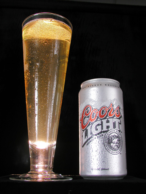
Nice condensation going on, interesting angle -- though I would've chosen a more downward approach to show the top of the can that we all know so well.
The glare and reflection on the front of the glass detract from it a bit. I might have preferred if the glass was somehow lit from behind to show the contents sort of "glowing". I don't exactly know how this would have been done to preserve the stark black background, but I'm sure it is possible. Maybe a concentrated light source shining right down into the glass from above, as to not disrupt the rest of the picture. I must also say that it seems slightly uninteresting in my opinion, but I still like it.
Nicely done. Very clean and sharp, with no distracting elements aside from those reflections. The upward angle has caused some perspective distortion - the can and glass lean towards eachother. Not a big deal, but it does feel a little odd looking up through the glass. That's a wicked hotspot at the bottom.
Nice inviting setup of the photo with the droplets on the can and glass. I would have prefered a lighting technique that avoided the blown highlights and reflections. The horizontal line just above the base of the subjects is also distracting? You might want to consider a longer angle lens for a similar shot to avoid the converging perspective, unless this was your intended effect? Good effort.
Excellent perspective but I would have placed it on a light colored surface, not neccessarily reflective, just something brighter so it doesn't look like it is floating. Kind of miner though, I really like it.
Having just visited Colorado over sprint break, I became quite familiar with the silver rockies. Did you try this shot with a background? I just wonder if it would be distracting or helpful.
Nice angle. Maybe a little too much reflection from the flash. I haven't tried it myself, but have been told that you can deflect the flash with an index card to minimize the reflection.
Nice photo, but the lighting needs more control for this kind of thing, considering there are bright highlights on the front of the glass and the can. Advertising shots avoid that kind of distraction. The camera angle also makes the composition a little bit awkward, because the perspective makes the verticle lines slant a bit.
You have the right idea on this shot however barrel distortion makes the glass and can look like they're leaning in. I like the water on the glass and the black background works pretty well too. I wont judge you on the bla beer though :)
Dude!! This is a pilsner glass!! Just kidding :) i think that ALL beer ads should show a nice rich head on the beer. On the top right side of this shot, there is a little background 'noise' that possibly could have been cropped out for a higher impact shot. The lighting here may be a tad strong but the overall quality of this photograph is very nice! Good work!
This works better than most boozer adverts, but I still want to "see the good times". More action in the beer might have been nice, too. Photo 10 Advert 9 Creativity 8 total 9
Ug, horrible beer. Don't worry I won't hold it against you. :) I don't like the really low angle you have here though. The lighting may have just been a little too hard. There is a spot on the glass at the base where its really bright and its distracting.





 Add photograph to your favorites
 Add photographer to your favorites


