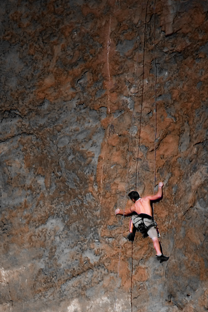
This is well-composed and has good clarity. Something about the color and lighting is for some reason a little off-putting. I guess maybe I wish the rock had a lot less orange in it...I tried switching it to black and white, which to me looks good. And that the lighting was more even, it's a pretty harsh contrast between the very dark top and the bottom.
The color of the rock, brownorange, on which he is climbing adds a lot to this composition. I like it, but the contrast between man and rock is a bit over the top. 7
This really holds my attention, as I get no sense of scale from the texture of the rock. I think it's the size of the dark patches. I look at the rock and it looks like a pebble, then my eye falls on the climber and I realise the scale and then I look back at the rock again. I hope I'm making sense.
interesting idea here. Perhaps more emphasis could have been placed on the rope as a bridge from bottom to top. (Would showing the top of it have helped in that regard?) Thanks!





 Add photograph to your favorites
 Add photographer to your favorites


 Photographer found comment helpful.


