| Author | Thread |
Comments Made During the Challenge  |
|
|
02/22/2005 11:12:05 AM |
|
think i'm gonna try paint this! :) 8 |
|
|
|
02/21/2005 11:51:06 PM |
|
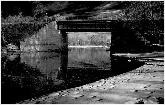
Wow, you found a wonderful level of murkiness in this scene - it invites the viewer to search for an escapee amidst the shadows. |
|
|
|
02/20/2005 08:17:23 PM |
|
Almost looks like it was shot with IR film. |
|
|
|
02/19/2005 04:26:08 AM |
|
IR picture? I don't know if it appeals to me in this photograph. Wonder what it would of looked like in color. You have a lot of dark areas here. |
|
|
|
02/18/2005 08:08:56 PM |
|
I like the way you've mixed the water and the sky into a dark murky atmosphere! |
|
|
|
02/18/2005 06:46:37 PM |
I like the B&W toning here, because it looks a lot like how I did it. :)
The shoreline works as a good leading line, the dark water vs the shore provides good contrast. Only the brightness of the area under the bridge is strange, it looks like a different B&W editing. Not bad at all becasue it provides a clear point of focus for the viewer. I like it how that works out. |
|
|
|
02/18/2005 01:03:03 PM |
|
Wow. How did you get the sky so dark above the bridge and the view through the bridge so bright? Very dramatic. I do feel, however that a large portion of the foreground is redundant and that cropping away about a third of the frame from the bottom might add a little more impact. |
|
|
|
02/18/2005 06:41:12 AM |
|
Good quality, average composition |
|
|
|
02/17/2005 07:47:55 AM |
|
|
|
02/17/2005 04:15:01 AM |
|
really good motif, maybe it would have been better just as it was shot or in plain b/w, and by the way, maybe a bit closer framing would have been nicer on my opinion |
|
|
|
02/16/2005 05:19:24 PM |
|
Nice and broody. I hope that's what you were going for. |
|
|
|
02/16/2005 03:42:08 PM |
|
B/W does wonders for this one--it really brings out the shapes. |
|
|
|
02/16/2005 01:10:35 PM |
|
This is a very interesting photo..love the sky in the background..and the extreme contrast is perfect in this case. |
|
|
|
02/16/2005 10:27:09 AM |
|
|
|
02/16/2005 01:43:56 AM |
|
like a movie... telling a drama... nice contrast! |
|
Theme:
Classic /
Light /
Dark
Home -
Challenges -
Community -
League -
Photos -
Cameras -
Lenses -
Learn -
Help -
Terms of Use -
Privacy -
Top ^
DPChallenge, and website content and design, Copyright © 2001-2026 Challenging Technologies, LLC.
All digital photo copyrights belong to the photographers and may not be used without permission.
Current Server Time: 10/15/2026 12:13:50 PM EDT.







 Add photograph to your favorites
 Add photographer to your favorites


