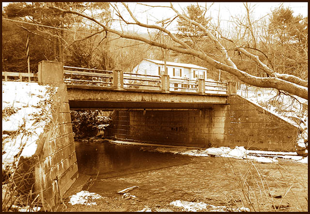
This photo just seems a little plain to me. The sepia seems washed out, and the composition a little uninteresting. The bottom third of the shot seems unnecessary.
I would save Sepia for scenes and subjects with simpler, cleaner lines (to empasize the beauty of the design.) The variety of shapes and texture in a scene such as yours might be better served with definition by color.
It seems to me that the snow and the house are a little overexposed. Personally, I feel that these areas are too bright in comparison to the rest of the image.
I don't think the duotone color you have chosen does your photo justice. It pops out at me to much. I think a darker feel would of been better, like b&w. Or even the colored version. Seems to lack contrast and very busy. I think you framed it well, i like the tree limb in foreground and the house in the background. I wish you well in the challenge.
good composition but the sepia color doesn't seem t work for this and a shallower depth of field whould have drawn more of a distinction between the bridge and the house in the background.
There are many similar pictures in this challenge. What separates this one from the crowd for me is the sepia rendition which really works well here. Color rendition would just simply kill the picture. (7)






 Add photograph to your favorites
 Add photographer to your favorites


 Photographer found comment helpful.


