Author Thread Comments Made During the Challenge
Post actions
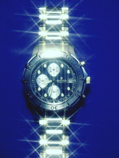
Love all the sparkling effects on the band. Wish the watchface were crystal clear... pardon the pun.
Post actions
Good concept, the focus on dial is lacking the detail needed to sell the product. I don't see the story that I feel is essential to sell.
Post actions
I like the starlight filter -- but the highlights are a little too bright, I think. The fact that the watch is JUST off center bothers me, as do the crooked band skewed over to the left at the bottom and the way it's cut off at the top (this only because it goes all the way off the image at the bottom).
Post actions
Post actions
Pierre Cardin ? The bling-bling makes it look a little blurry. You also cut off the bottom of the watch, which doesnt aid in the overall effect. I don't think the blue background works either.
Post actions
Post actions
nice effects without losing watchface
Post actions
This is nice but the star filter is almost too much, an dthe image is a bit on the soft side. The top of the watch is a bit too bright.
Post actions
Your starlight filter has taken over.
Post actions
Nice effect with the twinkling, but it's a bit off center.
Post actions
i see your title but i can't read it on the watch
Post actions
The star pattern on the band is good. Didn't like the flare on the watch edge, definitely detracted.
Post actions
This is really cool and I give it high marks for sure but I think it could be helped if it actually had a little less lighlights.
Post actions
it's a great effect (star filter I assume), but I think that there you've ended up taking away from the actual watch face itself
Post actions
the 'star filter' effect works very well to make a feature out of the reflections.
Post actions
I like the way the light sparkles, but I think it might be a bit much. I would have liked to see the name on the watch and not the title.
Post actions
Nice work, but think I would have tried to minimize the bright flash reflection at the 12 o' clock position. The rest of them make it look luxurious.
Post actions
Post actions
Nice shot but the star effect just seems a little too much.
Post actions
Nice, but the reflection is a but much at this angle.
Post actions
I htink the shiny bits are too shiny
Post actions
Post actions
It's too sparkly... kinda like an early 80s advertisement. I don't think the blue background sets off the watch very well, it makes the silver seem harder and cold.
Post actions
i think you overdid the "shining" effect.
Post actions
I know you went for sparkle, but maybe overdone. It makes the face of the watch illegible. All advertisers want the product's name to be readable.
Post actions
Wow! Maybe a little overdone. Other than that, perfect!
Post actions
Nice flares, but I woudl have liked to see a bit more detail on the face.
Post actions
This filter you use doesn't appeal to me... but I guess that's only my oppinion...
Post actions
Post actions
very cool.. the only thing missing is the text to close the sale.
Post actions
Nice advert, very shiny! Nice use of starry filter. Photo 9 Advert 9 Creativity 8 total 9 (what are the words on the face of the watch under Piere Cardin?)
Post actions
The sparks are very nice, but the watch seems to be out of focus.
Post actions
Pretty shot, harsh glare at the top of the face is distracting.
Post actions
Use indirect light to avoid the reflections.
Post actions
too dark, and the sparkles take away from the face of the watch.
Post actions
i would say overdone on the catchlights, but i think this is a great effort!
Post actions
Sparkle, sparkle, sparkle... Wher'd the watch go???
Post actions
I like this. I think the one bright spot on the rim of the face at the top and all the sparkle don't mix with the dullness around the rest of the face frame. It's still up there with me.
Post actions
This is a nice concept but the lighting is a little harsh.. The watch is off center enough that it's distracting...
Post actions
uneffective cant see the name
Post actions
Post actions
Wow, how did you get those points of light in just the right places? I love this.
Post actions






 Add photograph to your favorites
 Add photographer to your favorites


