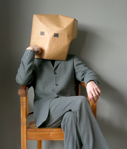
I wanted to produce a 'perfect' portrait, to off-set the joke. So I've gone for the real balance of smoothness and evenness of light and processing, and my present feeling is that I've done that moderately well. Ideally, I'd change the background fro something more textured and move the chair away from it, although i think the shadows there serve to emphasise the three-dimensionality of the image: I just suspect some folks aren't going to like them. And a flat grey background would have been so very dull.
There's a whole wealth of experience extracted from my college drama teachers in the creation of that 'head' - mask work is deceptively simple in appearance, but profound in effect, and i feel that I've got somewhere near achieveing something with that. I don't know that I'm expecting anyone to understand it - perhaps David Sidwell, with his theatre experience - but the factors are: the angle and tilt of the head, the positioning of the 'eyes', the accidental but nevertheless selected angles of planes in the paper bag - ask yourself: oes it look just like a brown paper bag, or does it actually have some quality of 'face' about it? Do you get a sensation of expression from it, of mood? Of course, I think there is, but I might be far too close to this image now ;-)
Statistics
Place: 37 out of 247 Avg (all users): 6.3077 Avg (commenters): 7.8750 Avg (participants): 6.0196 Avg (non-participants): 6.5640 Views since voting: 2052 Views during voting: 585 Votes: 325 Comments: 58 Favorites: 7 (view)
You don't look much like you sound, Ed. I had pictured more oval eyes and perhaps a roguish touch of 5-o'clock-shadow towards the southern extremeties of the bag. The inscrutable expression is , however, exactly as I had anticipated. I really can't imagine how you managed to keep a straight face.
Had this pegged for second (Behind JJ) - how it fell this far into the thirties really surprises me. I really thought you nailed each and every element of the dpc recipe for success - A) it jumps right out at you. B) It's technically spot on C) It's lighthearted and as a bonus contains dpc specific humour.
Ah well - you made me laugh, and a 6.3 is nothing to sneeze at.
most excellent work, highly underrated. maybe the lighting on the bag was just a tad to strong, washing out the finer textures that might have added more character to the image?
I had to go find the "hide my name" button to comment on this photo, lol. Ah....what talent and imagination are demonstrated here....everything is perfection. I love the fact that the suit and back ground are the same color and the sack and chair, too. Great work...10.
Ah yes, I always wanted to see a close up of this guy. Your sense of humor, while good, is certain to invite the bell curve, however, I fully appreciate the humor of this portrait by proxy.lol Bumping up. A very neat presentation with great lighting.
nice thought well exicuted clean and good graficaly i don't think the title was nessary but there isn't much u could call it so the vote goes to the thought.
Seems a bit of a cop out for a self-portrait, but I think I'm just jealous I didn't think of covering my ugly mug this way! The only thing that I think distracts from this photo is the uneven background, other than that a great shot and I love the pose. 9
this is a RIOT! and sure to be one of the most commented on images in the challenge. well done, all the way around. lighting, colors, composition, pose--it all works. good luck!
TOO funny! This is a clever photo, but I'm not sure how many new people to DPC will get it. I really hopw that it doesn't mark you down, because this is really funny. The formality of the pose and the suit and the fancy chair is well offset by the paper bag. I might have tried moving a touch farther away from the backdrop (but not if it made funnier shaddows)
Great lighting, good colors, and fuuunyyy. I just wish the bag was squared up on the right hand side where it bulges out, but other than that perfect execution of a clever concept.
both hands are overexposed, the image seems to lack "black", and too little contrast for my taste.
but
It is very funny, and sharp/detailed. Normally I would reduce your score because you're hidding your face, but since this is so incredibly funny, I will actually bump up a little. 7 good luck
Beautiful quality shot. Funny idea if a touch frustrating - LET ME SEE YOUR FACE DAMN IT!!!!
But then I s'pose you'll be posting the bag-off version when the challenge finishes. If not then a DPC mob will be formed, track you down and we'll show it for you. OK?
This is great! Not only is it funny but it's a good portrait too. The lighting is good, even with the shadows, the pose, the grey suit and walls compliment each other and the chair adds a splash of color contrast. The only thing I would have liked to have seen is a fuller shot without the legs cropped out.





 Add photograph to your favorites
 Add photographer to your favorites

 Photographer found comment helpful.


