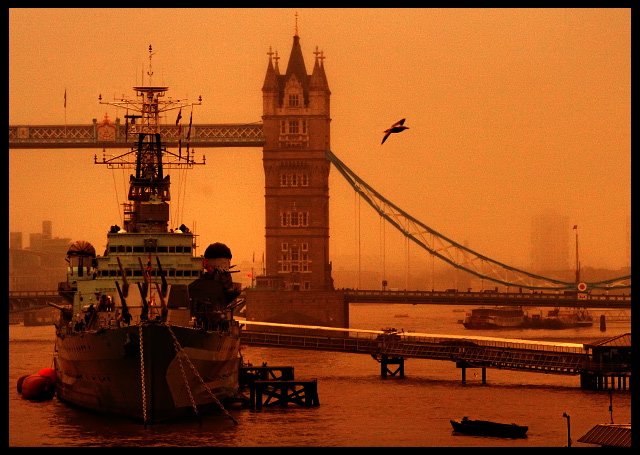
A very impressive image because the ship occupies the bulk of the balance and major attention. The coloration leans towards a monochromatic rendition with certain bands of colors missing. This has a dual effect of creating a strong impression, however, upon further study one detects an interference with the natural tones. Yet, while there is a touch of noise, the general effect will be loved by some and dismissed by others.
Its major strenght lies in the superb composition. A painter would have placed that bird right there. Note how it leads the eyes back in the left. The bulk of the ship creates a ballast to nail the viewer's main reference. The eyes then can roam but always return to this safe spot. An image with strong verticals brought to prominence by the sweep of the bridges cables on the left, then the bird, then the dock.
I have just observed the original. This explains the rendering and the why of the coloration. Personally, I would have prefered the sepia rendition because the composition is strong enough.
It is the glorious glow that wins over the viewer and then the composition begins to reveal its strength. The image has charm and some will accept the effect because it is unusual and a very good mood setter because of its monochromatic feel which awakens the nostalgia of the old tin plates. Others may find the tonal range too contrictive much like images which concentrate on certain zonal values at the expense of others. As is it has an aged look much like images which begin the fading process. This in itself is appealing.
I loved this picture from the first momment I saw it, it was my favorite and I gave it a ten right away. Not only because of the great composition, the old postcard look ... it should have finished among the top ten in this challenge.
Thank you for creating a shot where there's more interest than just a pretty bridge. This is composed really well, has vibrant color, and lighting that creates a really neat mood. One of my top picks.
I guess that you were going for a low-key approach here, but I feel that the end result is a little flat. I think that the gull spoils the negative space in the upper right. I can just make out a blob next to the mast of the Belfast - is it a dirty sensor?
Superb take on an old favourite location. Keeping in only one tower of the bridge in order to concentrate on the little pier would never have occurred to me. The gull is a bonus!
This would have been an awesome shot had you left it alone, I think. The toning is just creepy-ish, and there's an awful lot of noise in the background.
Beautiful shot. This somehow manages to convey warmth of light while still feeling rather cold and gloomy - the water and boats perhaps? Excellent composition, and the deep depth of field works beautifully. I can see people complaining about the slight grain, but I like it.




 Add photograph to your favorites
 Add photographer to your favorites


 Photographer found comment helpful.


