I would have perhaps done a comparison for this ad - before and after lip and/or tongue cancer. Besides being nasty filthy disgusting habit, this ad could have used better lighting (too many shadows)
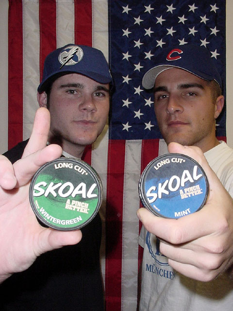
If any advertisment would appeal to a target audience, this one would. Only two recommendations: wintergreen guy needs to put his finger down to get rid of the shadow on his neck, and mint guy's hat needs to be a different color -- it blends with the flag. Did you mean for the shirt to have a german word on it? Good picture.
Nice try. It appears the foreground is over exposed to the point of washing out the main subject. There may be a different technique you might try for a similar shot in the future to get a more even exposure.
A little over exposed on the hands ... I would have lowered their hands slightly to get them off of their faces ... and I think the Skoal has had some adverse affects on the guy on the left ... he cant even put a cap on straight!
I'm not American, so there could be a lot that I'm missing from this... but what does the flag have to do with whatever those Skoal things are? It's just confusing to me.
LIghting on the hands is pretty harsh as is the shadow on the left guy's neck. And the flag's backwards (yeah I know, no big deal -- but the Skoal marketing people aint gonna let that go in a magazine, etc..) Oh yea, and the left guy's fingers.
blatent americanism, and lack of diversity, and what is wrong with your lack of personal restraint in mouthing off in the forums about how you picture is doing. if i were you i would be happy you live in the US because we would have you in jail here for being a complete waste of resources.
both hands in the same positions holding the products and lower, below the chin as on the left, would have made this a lot more appealing....more overall lighting would have helped remove the dark shadows and over exposed forefront...need i mention...the middle finger on left shouldn't be flippin'
The colors look a bit washed out to me. And the shadows on the face and flag are a bit distracting. I am normally guilty of poor lighting, so maybe I notice it more than others. More light on all subjects, or a light that did not cast a shadow on the flag and people would have been a bit less distracting to me. But the colors seem very diluted.
Neat idea! I think it would have been better if you put more focus on the Skoal cans instead of the guys. Even so, I think a lot of good ole' boys would go for this ad.







 Add photograph to your favorites
 Add photographer to your favorites


 Photographer found comment helpful.


