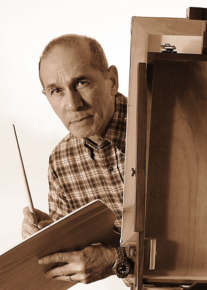
One light with umbrella coming from the left. The second light about the height of the base of the easel and bounced unto wall for backlight and (like shooting pool) bounced from wall to plain white canvass as the fill.
Statistics
Place: 8 out of 247 Avg (all users): 6.7964 Avg (commenters): 8.1778 Avg (participants): 6.6815 Avg (non-participants): 6.8983 Views since voting: 3558 Views during voting: 540 Votes: 334 Comments: 61 Favorites: 4 (view)
I completely missed this photo during the challenge! I don't know how!
This one is wonderful. The sepia toning works great for me. I like your expression and the clean feel of the photo. (There's a slight smell of wodden saw-dust in the air...)
Belated congratulations on your top 10!
I didn't recognize you. You look normal! lol...just joking...
Congratulations on your 8th place finish with this perfectly composed capture. The sepia tones are very pleasing. A wonderful photo.
This is just wonderful. I loved it from the first time I saw it. Wanted my colors to come out like this but NO WAY!! Still learning. Congratulations on your 8th place. :)
Hi Dan! I found you.. Not that you are hiding :). I like the colors and the expression and composition are such that the face completely holds my attention. I really like that about this picture. Not sure what the title means, guess I'm missing a reference...
I think I know who you are... Graphicfunk? I think I owe you a comment, you have commented on lot´s of my shots and always been helpful and honest and I appreciate it.
Anyway, good shot, I love the tones in this image and usually I don´t like sepia but it works in this photo. Unlike most shots in the challenge this actually tells me a litte bit aboutyourself, you made the portrait very personal and thats good. The lighting is also very good. All in all, a very good job so keep it up.
one of my 3 10s - I love the pose and the sharpness as well as the sepia treatment. The watch is a small distraction but not so much that it doesn't deserve a top rating! great portrait!
Returning for comment the second time (the first it timed out on me!). Very good technical studio work, as usual, and I especially like the "character" method of this portrait, as it tells me you are also an artist, and a portrait should, in my opinion, tell me something about the subject rather than just a mug shot. It does, however, have a bit of a posed look with you drawing the camera/photographer, whereas if you weren't looking at the camera, it might appear candid and more natural. I think that you were going for the dynamic interaction with the viewer though, and you achieved it.
Norman Rockwell is the first thing that popped into my head when I saw this. (Before I read the title). Great tones. Brilliant work as usual !!!
Composition is outstanding, detail is crisp, lighting perfect. Only one idea for improving this one, and I'm not sure if it is much of a big deal. The lead-line from the easel is drawing my eye down to the watch and pulling attention from your face. I think by removing the dark watch you could improve the over-all balance. The introduction of the electronics also gives this a time stamp to what would otherwise be a timeless portrait. 9-1/2
My choice for Blue Ribbon. Great intensity in your stare; very much like the fact that you've added context by including the painting props. Desat (sepia?) works beautifully. Congrats on your "10".
as always, excellent work. as i don't know squat about portraiture, i'm just going through the images, looking for what works and what doesn't. the lighting and composition are perfect, and the treatment is very well-suited. do hope you'll share your lighting set up with this is over. good luck!
Composition: 7
Technical: 7, Great focus and I like the sepia coloration
Appeal: 6
Challenge: 8
Overall Calculated Average Score: 7, good creative effort
Great study.Love the sepia that pops against the background. The plaid shirt works great too. Most important is the focus of your eyes. Good luck on this masterful composition.
Hmmm, I wonder if this is Ubique? Nice shot, whoever you are! I Iike the sepia tone and the pose. It's possible you could've done without the watch, but that's just pickiness. Very sharp and clear - the eye is drawn straight to you. The off-centered easel adds a relaxed feeling to the image.
One of the things I love about Norman Rockwell's illustrations was his use of color, and rich (even over-saturated) colors might have made this fine image even better. The composition and other technical aspects are just wonderful. One of my top picks. Well done!
I like the expression very much, and the painter theme works well for me. Unfortunately, the high key background is so brilliant that I feel it distracts from the subject. An uncluttered natural backdrop would feel more at harmony in this image to me.






 Add photograph to your favorites
 Add photographer to your favorites

 Photographer found comment helpful.


