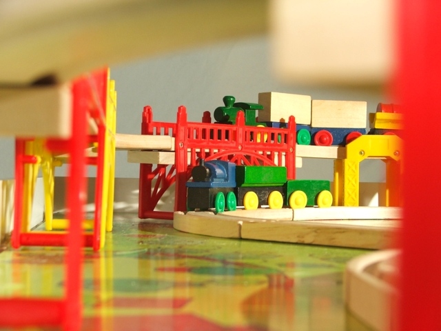
The only post processing I did was lightening the picture just a tad. The only programs I have are what came on my computer so I really don't have a lot of processing capabilities anyway.
Statistics
Place: 319 out of 424 Avg (all users): 4.7599 Avg (commenters): 5.0909 Avg (participants): 4.4410 Avg (non-participants): 5.0655 Views since voting: 981 Views during voting: 439 Votes: 329 Comments: 12 Favorites: 0
A lovely colourful image. However, I find the out-of-focus blocks framing the image to be a bit too invasive and I think that a little sharpening could add a bit more punch.
i like this because it's different, and it's got a nice p.o.v. I think if the levels had been messed with a little it could have really popped in it's color and be a better photo, but not bad.
A very different approach to the subject. Support on the right out of focus and the overhead is way too distracting. Blues and greens seem yellowish. Play with white balance to compensate.






 Add photograph to your favorites
 Add photographer to your favorites


 Photographer found comment helpful.


