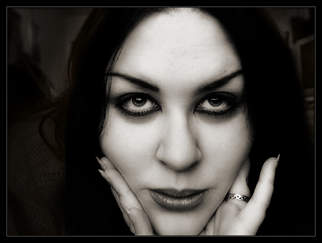
Self portrait, obviously. Taken looking out a window, with the camera sitting on the window sill. For some ridiculous reason, I turned on the light for backlighting.. thus ruining the black background that I didn't realize I was going to want. Oh well. I was lying on my stomach with my face right up to the camera, chin resting on my hands, so the angle was peculiar. Unfortunately, it's far from perfect... but I liked something about it, so what the heck :) I've had a few decent scores lately, so I don't really care if this gets slammed. Nobody better tell me this is over NeatImaged, since I didn't even use NI!
Editing: Resized, cropped, curves, hue/saturation, blurring, adjustment levels, cloned out some stray hairs, dodging and burning, slight sharpening, selectively blurred and edited the curves of the background, then added a border.
Statistics
Place: 25 out of 247 Avg (all users): 6.4817 Avg (commenters): 7.5185 Avg (participants): 6.2945 Avg (non-participants): 6.6667 Views since voting: 1914 Views during voting: 547 Votes: 328 Comments: 31 Favorites: 3 (view)
This is a perfect shot focus wise. Sometimes its best to keep it simple and this isa great selfportrait. The highlights are great, and your hair blends in nicely with the background. good detail on your skin and nice eyes...I originally gave you a 6. congrats on a top 25 finish !
A very gothic look, which I like a lot. The lighter areas in the background are a little distracting and could do to be edited out, but otherwise this is a very strong portrait.
Very well done, I like it a lot. This would have looked great against a light background too. Interesting look, great tonality...all in all a very nice portrait.
Wow! Very well done! I love those eyes! I might have tried shining some light on the hair and leaving the background black, or maybe let both go all black. That gorgeous face really stands out nicely in this photo. Want to model for me?
So distracted by the fact that I saw the same face, same expression, same pose, same lighting in the Pain competition just days ago... It's nicely lit, exposed and photographed. And though I know it' s not the same because the macara is not smudged in this one, the similarity is too strikiing to ignore. So what? Well every photo has its novelty factor; every trick wows less the second time around.
Amazing eyes!
I'm not too crazy about that funny face you're doing, but I like the lights and the texture of the skin.
and the eyes... did I say they are amazing?
Great light and pose but seems like totally the wrong framing. Such a striking image would work well dead centre and perhaps also in portrait format. Excellent technicals, though. Very striking and attractive. 8
nice pose... seems very natural and a little quirky? which is always a good thing... kinda sexy? might just be the subject though :o) either way, I like this one a lot.. great balance and light..
Hi, Mocabela (I assume). Nice pic ya got here. Looks like the tone is intentionally dark, but you did a good job holding the highlights. Given the title, I wish you were looking directly at the camera (looks like your eyes are focused a little above the lens).
Returning for comment. This is pretty intense--I really like the contrast here and the very sharp capture. I think it's great but I do have two suggestions for small improvements: I think both your hands should have been flush againt the cheek like the right, and then if it were just a bit more off center. I'd like to know a bit about your B&W conversion tecnique--I really like this. Bumping up.
Intriguing. well lit, well executed photograph, of course. Thevisibility of the background, or otherwise, confuses me a little - but that's probably the differences of viewing angle of a TFT screen. that single, differently placed finger really pulls the eye: don't know why you've done that, there doesn't seem to be anything there that warrants that draw. Fine photograph though.
Very gothic and very darkly appealing. Allowing the whites to show as much creates the classic look. A very good effort and of course, the make up is tops. Bumping up.
I love this. One thing I may have done is cloned the catchlight from the eye on the left and put it on the eye on the right, so they match. Other than that, I really like this. Best of luck.
This is such a beautiful portrait! I wish your whole chin was in the shot, though. Otherwise, really great job with the framing, contrast, and everything else.
Very unique toning on this image... Kind of a vampire-esque look to it... I like that your background has things in it, but they are very well managed so as not to be a distraction. Interesting when such a dominant foreground subject isn't necessarily 100% of the shot, the background really feel like a significant part of the feel of this shot. Nice work.
Intense! I would probably have prefered to see this in portrait format, the room at the sides is taking away from the overall effect. Other than that, I really like this.






 Add photograph to your favorites
 Add photographer to your favorites

 Photographer found comment helpful.


