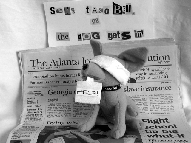
I'm particularly intrigued by the particular (fragments of) news items showing in the background. I'm curious if you were deliberately creating a multi-level message or if I'm just "reading" more into it than I should. Also that you were able to inject an element of humor into what I would have expected to be a tasteless subject (hostages, not tacos).
Hmmmm. Interesting. Maybe I am missing something (its late here) but I don't get the purpose of the newspaper. Otherwise it is an excellent photograph, with good use of humor.
I was pretty proud of myself for thinking of this as a solution to the 'no added text' problem. You should be, too. Great idea, and, except for a slight blowout in the blindfold, very well photographed. I can't decide whether B/W was the right choice. It does match the message, but I can't help but thinking, since color is the easy way these days, if the kidnappers would have bothered with a conversion.
Absolutely outstanding creativity!!! This is the toughest photo for me to evaluate. I going back and forth on this one between a 9 and a 10. Probably will not be able to settle on a score untill the very end. Though the shot has good exposure, excellent focus for sharpness and detail, and great composition, I wish the shadow detail on the lower left and upper right sides would have been pulled out with fill lighting. I'm not sure whether the shadow is the effect you were actually after? Excellent effort. I rate this one very high (9 or 10?).
cute idea, but i don't get the connection between the newspaper and the ransom note, oh I get it, it's to prove the date the picture was taken, okay but I still want to see the note arranged more artfully, maybe at an angle in the foreground
well thought out and set up. I think colour would have been better for this tho. The ransom note and dog would have been the only things in colour and really grabbed the viewer's attention. In B+W I find the newspaper too strong and distracting.
I usually am pretty harsh on funny ads because they often go for the funny over the advertising message but this one is right on. One of my three favorite photos.
and the product is? If its the newspaper, the dog should be a little more off center. Oh, I get it! It's Taco Bell! Too busy, I really didn't notice the sign at first.
This is cute! I like your interpretation of this challenge. The exposure and everything else looks good too. Moving the dog over a few inches to the right would possibly make a better application of the 'rule of thirds' on this shot... good job!
cute idea, but the ransom note letters came from a magazine.. I would have preferred seeing a stack of cut up mags and a pair of scissors in the back..





 Add photograph to your favorites
 Add photographer to your favorites


