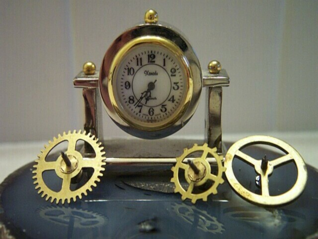
The vertical lines in the photo are part of the design of the wall in the background. I see this was rather distractingt, and I would have done better to but a blank piece of paper up for the background. Thanks for all the comments, they were helpful.
I like the reflections on the geode. The photo seems to be a little out of focus, and the white vertical lines in the background are a bit distracting.
the clock face seems a little dark, perhaps using some white card stock or something to bounce some light into it would lighten it up without creating a glare. I'm not certain what the two "columns" are on the background. If they can't be removed, I'd consider moving your main elements so those strips are more centered on the rest of the image. You might also try the 10 to 2 or 10 past 10 settings for the clock hands (traditional advertising positions) -- that way they're not all bunched up in the same basic spot.
I like the layout of this shot and the reflections are nice too :) The lighting on the face of the clock may be a little weak and I see those pesky vertical lines in this photo. I remember these in two of the stopped motion photos and I believe the resulting conclusion was a problem with an add on lens or something like that. I won't detract from my score for that at all though... Good Job!





 Add photograph to your favorites
 Add photographer to your favorites


 Photographer found comment helpful.


