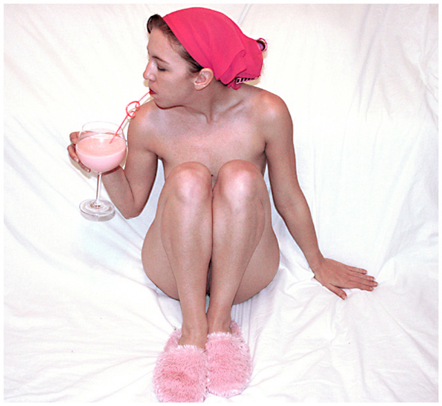
Shot in my living room. My model ended up having to work a double so i had to use myself and the timer.
Edits:
Adjusted selective color and levels.
Used an unsharp mask.
Cropped.
I'm having trouble resizing the image to be small enough to upload while still keeping it large enough to see, and maintaining the quality. I finally ended up saving at a lower quality, so i hope the compression isn't too noticeable.
Statistics
Place: 218 out of 270 Avg (all users): 4.6154 Avg (commenters): 5.0000 Avg (participants): 4.5241 Avg (non-participants): 4.7304 Views since voting: 2437 Views during voting: 774 Votes: 260 Comments: 10 Favorites: 0
I like the shot!!But the flash have "overreflected" on the nose, shoulders.. Maybe a filter would have been better.Just an idea, i don't think i would have do better than you!Congrats.
the cloth should have been a bit further from the model to avoid the shadows of nose and fingers ; nice lighting on the skin and good balance between nudity and humour
Self-portrait? The light in this shot seems a bit harsh according to the bright areas, ie. knees, rim of glass - reflectors or difusers of some sort may have helped. Also the wrinkled white sheet backdrop takes away from the image. Otherwise, the composition is decent and the pink theme is certainly adhered to. Hope this helps.
The concept for the photo is okay. Model is beautiful, you have met the challenge description with no problems and it's a creative idea. But here is where I think it could improve: First of all, the background sheet is distracting and also a bit contrived to me. It just doesn't look like a realistic setting. Second is the harsh lighting. I think it would have been more effective if it was somehow softer. I know not everyone has a pro studio, myself included, but I just think this photo could have been drastically better without that white backdrop and maybe with a softer, more natural looking light.
Oh, and be prepared to lose about 2 full points after the anti-nudity crowd gets done with you.
while you did meet the challenge, there are some areas which could use some improvement. i like your choice of white for the background. however, the wrinkles and creases in the sheet are distracting. one good way to minimize the appearance of wrinkles would be to have your model sit further away from the sheet. so the background would loose some focus. also, she appears to be sitting just slightly off center. sitting totally off center or dead center would make a stronger composition. and one last small thing is, one foot is slightly cropped. since everything else is totally in the frame the whole foot should be as well.
This just is not composed well. The backdrop, the pose, the lighting, the harsh tones, all of these things lead me to score the photo low. The shot might've been better had the DRINK been the focal point ahaha. Sorry!
This is going to offend a lot of people unfortunately. That's a little too much pink for some people. Wouldn't be surprising to see some voters trying to DQ it. But I like the audacity. Could create some waves in the forums... The picture itself tough seems very noisy and pixelish. I don't like the harsh light on her knees and shoulders since the background is allready awfully bright. It would have been a nice shot with a more diffused light and a better exposure.






 Add photograph to your favorites
 Add photographer to your favorites


 Photographer found comment helpful.


