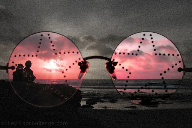
pretty straightforward: fixed a pair of glasses in front of the camera, shot a sunset at the beautiful La Jolla beach. In post-processing, adjusted colors within the glasses and desaturated and added noise outside. Cropped, adjusted overall brightness and contrast, cleaned with Neat image, saved for web.
Statistics
Place: 42 out of 270 Avg (all users): 5.9434 Avg (commenters): 6.8095 Avg (participants): 5.7867 Avg (non-participants): 6.1478 Views since voting: 1594 Views during voting: 459 Votes: 265 Comments: 25 Favorites: 2 (view)
Ah, I forgot to comment on this fine photo. It was my top pick. The two figures sitting facing forward was a very nice touch, as was the added grain as commented below. Surprised this did not do better, but overall a great entry.
Mmmm. Trendsetter. Good idea - very creative. Like the contrast in grain/smooth too. Only criticism is subject behind. To fulfil the concept's promise you could have used a subject that changed with the 'happy view' like dead flower/living flower, for example. But that would have meant some set-up, printing out pic and sticking it on glasses, etc. So I'll shut up!
Interesting picture, where did you get Elton Johns glasses? ;-) I think I would have liked to see the couple silhouetted against the pink sunset without the glasses in there and perhaps some of the bottom cropped off. I'm a huge fan of sunsets. Creative though!
A great idea. A lots of potential to the title. Too much grain. I am also not sure I like the scanery - I think taking a pictures of tons of people would have worked better with that idea.
Great technique, would have been a good entry in the breaking ground challenge. I personally use my sunglasses in this way! I like it and the stars in the glasses add a little something extra. I do have a problems with the grainy B/W portion of the photo, as compared to the colored one, maybe too much adjustments on the B/W portion? Neatimage would probably have taken care of that. Keep up the good work.
I thought of this and had no glasses. Far better than anything I would have done. The couple on the left add to the Valentine feeling, the sea to romance, and the setting sun to the hope for a beautiful evening. I will give this a 9.
Returning for comment: The idea is beautiful. The photo is nice and I really like the pink parts, but the gray is a bit too grainy IMO.
Yet a good photo altogether. Bumping up.
Great idea! noise reduction (unless it was intentional to leave noise in the grayscale part of the photo) might help the image look better, but its a minor detail. 9
This is quite nice but I think it would have worked better without the stars. I understand they are meant to represent 'starry-eyed optimism' but the star at the left of the frame obscures the sillhouetted couple. I don't usuallly enjoy selective desaturation but here it works well. The shades looming so largely in the foreground give the image the feel of a surrealistic painting. The soft, grainy appearance of the sky enhances the theme quite nicely.









 Add photograph to your favorites
 Add photographer to your favorites

 Photographer found comment helpful.


