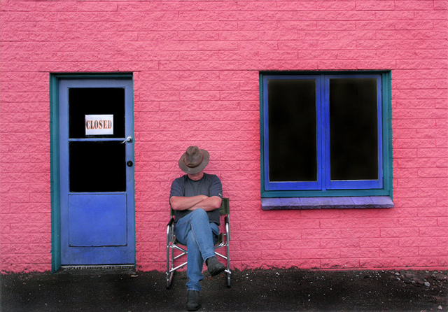
I love this. Somehow I never ran across it. Terrific visually and texturally. Nice that the skin tones almost mimic the color of the brick building. The "Closed" sign really finishes it off. Well done. I see why it got top 10.
I wasn't around for this challenge but this is a great image! Very nicely composed and the colors are really well balanced. Very nice job. If I had voted it would have scored at least a 9. Nice work!
P this is really great, i love your composition here, i must say though has anybody else noticed that your hat has two eyes a nose and a mouth?.... it was one of the first things i seen when the photo showed up.... excellent work here... keep them coming......
Ha! You're nearly right. It's New Zealand, & we're headed down the same path as Cuba, except our Prime Minister's beard isn't as impressive (yet). But she's working on it.
Can't remember seeing this place, and I've been to Rotorua often. Where is it exactly?
Riri Street, off Old Taupo Road. It's a small art framing business I just happened to be passing (I was following a pink bus, hoping it would stop!) Best wishes from Aotearoa. Paul.
While the lighting is pretty flat and the oomph of the color isn't all that, it still is a great image by its composition and the use of only a few colors: blue, pink, a bit of green and some black. You could call it a quadtone. :) 8
OK, I hope you didn't paint that wall while the guy was napping cause he might be a little pissed when he wakes up. But seriously I like it, but being me I would have squared it off (cropped it) to have it straightened at the bottom.
Nice, clean and technically well done shot. This couldn't have been taken any better (technically). I like the concept and execution but for some reason it just doesn't put me over edge. Can't quite put my finger on it maybe the square, rectange and lines are making this a too perfect picture, too organized or calculated. Don't get me wrong, I do like the shot and gave it high score but couldn't put it on top.
The negative space created by the pink BG makes a great back drop. Certainly brings the other elements to the forefront. Not really sure I'm crazy about the composition - maybe a vertical crop which incorporates the person and one or the other of the secondary elements, ie, window or door.
Distort tool in PS could have leveled the bottom of the building. The man really needs to be on one of the 3rds intersections. Great contrasting colours.
It's funny how this feels a little ccw rotated (just a tad) even though a reasonably close examination suggests it's not. Certainly the horizontal courses at the top are level, and the left edge of the door is vertical... I digress... I liek this very much, and hope it fares better with the voters than i expect it will. I scored it very high, and really appreciate it daring to be different. The tonal quality of the chrome, btw, is superb. Heck, the whole image is nailed as far as tonal range goes. Nice work.






 Add photograph to your favorites
 Add photographer to your favorites

 Photographer found comment helpful.


