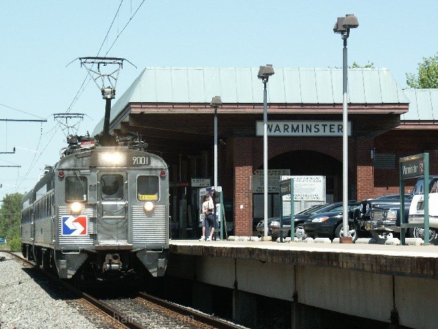
More an ad for a service than the product specified in the challenge, but really more a snapshot than anything. Might have been more effective to think of some way to show that the SEPTA is better than driving - like a view of the train speeding past a line of stopped traffic or something.
Good composition. I love trains so this immediately caught my eye. 2 negatives. 1. The train is not standing out enough.. the balance is more on the empty loading area. Maybe that could be solved with different lighting? Or different angle?. 2. The picture should have been taken with a crowded platform.
i keep reading this as septa: it's better than drowning... This is a great public service statement, but as far as 'ad' impact or appeal, it's lacking and i can't really explain why other than to say that an ad depicting one of these flying past say, a bumper to bumper highway 'parking lot' would work better...
I think for the title we should of seen happy riders. However, I do understand your point. Nice clean photo but the W in Warminster is cut off. Good idea but if the title wasn't there what would this photo say to someone?






 Add photograph to your favorites
 Add photographer to your favorites


 Photographer found comment helpful.


