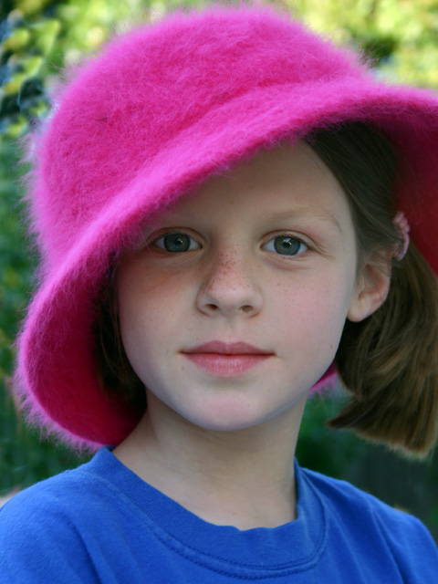
I like the subject matter and the composition, but the image has no punch. the face does not stand out enough. Perhaps it is the lighting. Perhaps if the bright green in the background were cropped out. Oh, hell I can't figure out what it is but you are on the right track or I wouldn't have come back to look at this 6 times.
Great model. I would stay on good terms with this one.
Overall a nice enough portrait, but I offer a suggestion to fix the cool hue on the face of the girl due to the reflection of blue light off her very blue shirt. That's really the only major ding in this otherwise fine photograph. Best of luck. 6
Very cute capture, nicely composed and exposed. It's funny, this photo causes me to focally battle between the hot pink hat and that frolicsome face. Normally I would have considered the hat to be a distraction, but hey, it's a pink challenge. Great job.
This is beautifully done, by an artist I bet. I love it...if it were mine I would have cropped it just under her chin so the blue shirt didn't show. That makes it more square, but I think it works better
What a cute shot, love it. Have you tried getting a touch closer (top and left side, to eliminate the green), maybe showing only part of the hat? I don't know if it would work, but I think it might be worth trying. Her eyes are lovely, as are her freckles. [9]
A pink, or even white, shirt would have made this really harmonious and would have given it more impact. The portrait is very interesting, though and the lighting is quite good.







 Add photograph to your favorites
 Add photographer to your favorites


 Photographer found comment helpful.


