COMPOSITION
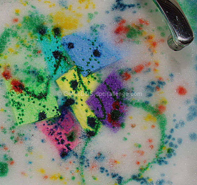
I think the composition in this shot is "scattered" but has a lot of potential. The randomness of the colors is great for keeping the eyes moving, but then they just settle on the faucet. I imagine that is because the faucet looks a little out of place to me. I would recommend cropping it so that just the sponges, no faucet, filled the frame.
TECHNIQUE
The colors here are awesome. So many times the darker colors all look black, but here they are distinguishable. It looks like the sponges have been "stabbed" and have dribbled all of the soap! My only suggestion would be to get a lot closer. Get right down near the sponges so that the texture of them and the bubbles are nice and visible. I think doing that would have given your shot a lot more visual, and immediate, impact.
OVERALL EFFECT
This looks like a fun shot to set up. It's colorful and thus "happy." Nice work. The faucet really doesn't fit in it though, for the reasons mentioned above.
Would be even better without the tap but I still really like this.
Great idea - kinda like a kid's painting with style (that's meant to be a compliment not an insult btw!). Love the colours. Well done.
Creative use of color. I think it would be nicer without the faucet. It gives it away too quickly. It would be a little more of a mystery without it. Just my opinion. BUT.....I like it. I've done a little sponge art myself. I like yours.
Well, it's in the kitchen sink, so I guess it Meets the Challenge.
Lots of color. Nice and Sharp. Tap is in Focus.
Visual impact in Stunning to say the least.







 Add photograph to your favorites
 Add photographer to your favorites

 Photographer found comment helpful.


