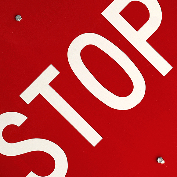
My second submission. I had a tough time with this category - none of my pics were coming out as I envisioned. This, sadly, was one of my better ones. I like the bold red, and the angle gave me a feeling of being a little out-of-control (stopping right before you hit the sign). I doubt this will do well, but I'm determined to try to get out there and take pics.
Processing:
- Crop and Rotate
- Levels adj layer
- Contrast adj layer
- Hue adj layer
- A little sharpening
Statistics
Place: 54 out of 292 Avg (all users): 5.8007 Avg (commenters): 7.7143 Avg (participants): 5.5440 Avg (non-participants): 6.0000 Views since voting: 1085 Views during voting: 395 Votes: 286 Comments: 14 Favorites: 1 (view)
Bang! Great impact. The sign is straight in my face, as if I had stopped "just in time". I also like the sharpness, the saturation and the screws. Very simple and striking. 10.
This is a boring idea executed so well it is audacious. The square format and the diagonal framing work amazingly well. Lovely geometry, you win the ribbon for the bravest entrant.





 Add photograph to your favorites
 Add photographer to your favorites


 Photographer found comment helpful.


