Cute sign and it'll draw a lot of laughs. The background is just a touch dreary for the lightheartedness of the sign. Should either be a bit more blurred or tack sharp. Maybe pointing the camera towards the sky would have given a better background. But, after all, you were there, and I wasn't. You take what you can get!
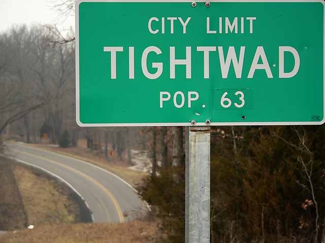
Great name for a town! The crop is a bit tight at top and side - obviously intentionally, but it creates a sense of tension. Perhaps "tight crop" = Tightwad!
I like this image. I like the background how it has a lot of natural looking things in it. I love natural shots. I also like the curved lines seen in the road. It gives the image diversity and it just adds to the picture. I like how the picture portays calmness. Nice job.






 Add photograph to your favorites
 Add photographer to your favorites


 Photographer found comment helpful.


