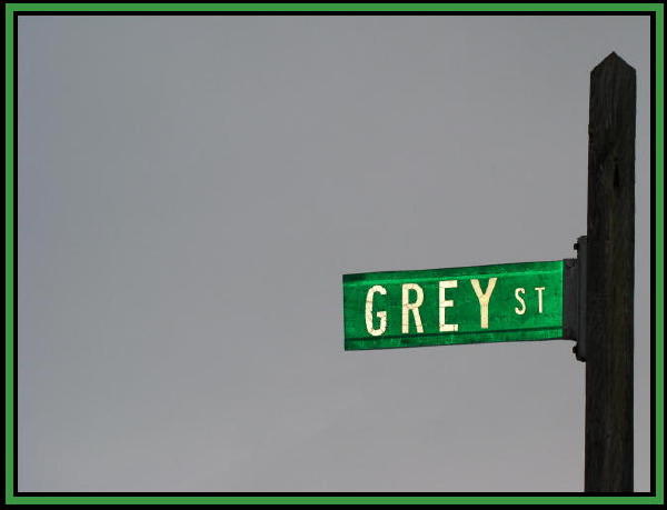
Challenge:Road Signs IV (Basic Editing III) Camera:Olympus C-4000Z Location: corner of residential street Date: Jan 31, 2005 Aperture: F2.8 ISO: 100 Shutter: 1/250 Galleries:Sky Date Uploaded: Feb 1, 2005
nice minimalism. i like the triple border, but i think the blacks are too thick i'd have gone with one pixel inside and out and expanded the green to fill in the space.
What a shame. The border just kills this for me and I don't hate borders at all. Great and different idea maybe if you mover the post into the fram a little it would have more impact.
Great shot, but the border makes it look like clip art, in my opinion. There's a lot of "artifacts" around the post & sign, which is from overcompression - the file size is only about 18K, but it can be up to 150K. Great effort though, i still like it a lot.







 Add photograph to your favorites
 Add photographer to your favorites


