levels
grey to 1.26
white to 242
black to 23
Hue /Saturation
blues sat-100 lightness-100
Cyan sat -50 lightness-50
Master +50
Levels
grey to 0.66
white to 184
reduce to 30 % for web
Added border
Statistics
Place: 1 out of 292 Avg (all users): 6.8849 Avg (commenters): 7.8125 Avg (participants): 6.6894 Avg (non-participants): 7.0349 Views since voting: 8186 Views during voting: 478 Votes: 304 Comments: 53 Favorites: 12 (view)
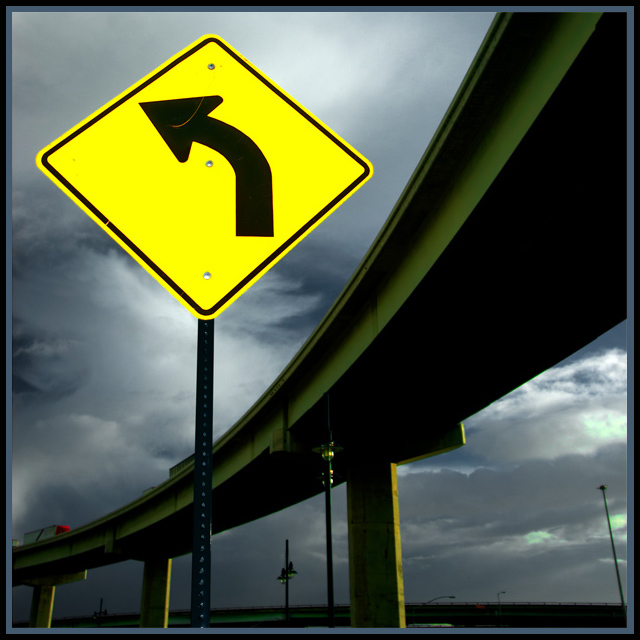
What a find! Congratulations on your blue and your acute eye for bringing this super cool image for our admiration. Who said Road Signs would be boring?
Thanks for all the comments, I am flattered by all the compliments and tend to agree with the critcal comments, particularly the ones about the greenish tint in the clouds. I should have noted in the main comment area that I got the brightness and color in the sign by hitting it with a flash at a low power setting.
Good job Brennan. If you scroll down you will see that I gave you an eight. I had a strong feeling this one would be in the top 5 and you won a blue ribbon. Congrats...this was a true winner.
Great composition gives the sign tremendous presence; it's a critical part of the image, not just a sign in a picture. Very nice quality photography & processing, too. 8.
Beautiful composition -- I really like the arc of the overpass. The sign is a bit too saturated for my taste, and a shame you couldn't clone out the big scratch in the sign due to basic editing rules.
The imperfection in the black of the arrow (sign's fault, not yours...) is a little distracting and takes away from what is otherwise one of the best of the bunch I've seen so far. Great composition, great contrast between the sign and elevated roadway, and the color of the sky does exactly what it should as a backdrop. Very nice.
I like the shot. Framed nicely and good subject matter. A little shame that you selective desaturation left your clouds bleeding green on the Right hand side near the lamp pole. Other than that, an excellent shot.
I find the grey in the border to be a little to much. Nice vibrant colors in the sign tho and it goes well with the highway. Good luck in this challenge. <6>





 Good advice
 Add photograph to your favorites
 Add photographer to your favorites

 Photographer found comment helpful.


