I like the tones in this shot - good job on the trees. Nice lines of composition too, although I think I'd like to see the sign a little more offset to the right. If you have any more of the shot on the left, you could include it with a wider crop - I think this might give it a more "complete" feel, as it would show more of the road's path. Still, nice capture.
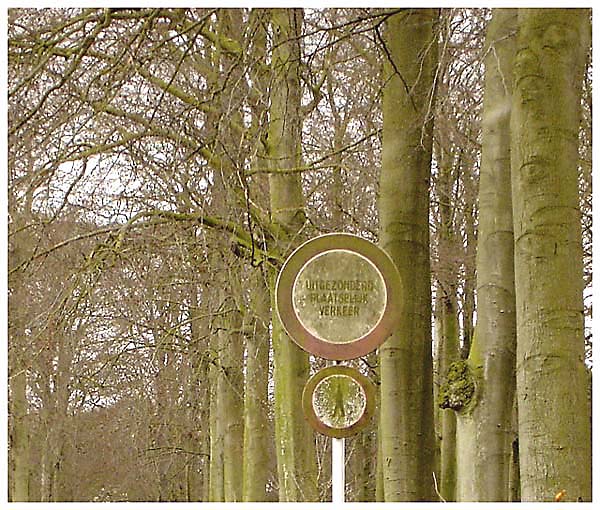
The idea for this image is OK, but the execution is not so good. It looks as though it has had Neatimage applied poorly and that it is oversharpened. Both combine making the image poor quality. Positioning the main subject (the sign) in one of the rule of thirds intersection points would improve the composition.
This would be a little stronger if there was more contract between the sign and the trees. The image as a whole has a very "flat" feel to it. Perhaps intentional...?





 Add photograph to your favorites
 Add photographer to your favorites

 Photographer found comment helpful.


